Friday, June 24, 2011

Spanish Artists Doing Time at Holmesburg Prison


Dear friends:

Philagrafika is embarking in a new project, working towards the next incarnation of the festival tentatively scheduled for 2014. The project is titled Doing Time, and consists of a site-specific work of Spanish artists Patricia Gómez and María Jesús González that will come out of a six-week residency in Philadelphia. The results will be shown at Moore College of Art & Design, our longtime partner.


Patricia and María Jesús, who live in Valencia, Spain, have taken a technique called strappo, commonly used by restorers to salvage murals from walls that are deteriorating or from buildings that are to be demolished, and applied it towards artistic goals. Strappo is a complex process, but it could be described as adhering a thin fabric on the surface of a wall with water-soluble glue, waiting for it to dry, and then peeling off the fabric, which takes with it the outer surface of the wall in question (and whatever images are on it). Once on the fabric, the paint can be seen right-side up because of the transparency of the type of voile used, or from behind if attached to an opaque fabric. If needed, the paint can be attached again to another wall or canvas with glue that does not dissolve in water, and then the original fabric can be moistened, peeled away, and the glue dissolved until the painting is visible again.


The artists, who studied printmaking in the context of a conservation school in Italy, consider their work a monoprint, which it technically is, because the matrix (in this case the wall) is transferring its ink (the paint) onto a surface (the voile), and it produces a single copy. They came upon this technique when priming a canvas that they had to staple to the studio wall because they did not have a stretcher. When the primer dried and they wanted to transfer the canvas to another space, they discovered that the back had taken with it the surface of the wall, and they thought that the colored shape of the decaying wall was a beautiful image in its own right.


Soon after, they decided to try the technique in more complex projects. Learning that the El Cabañal neighborhood in Valencia was slated for demolition, they brought bolts of fabric and painstakingly took the imprints of twelve of the beautiful Modernist houses shortly before they were destroyed. The resulting print, a roll 340 m long by 2 m high (about 1116 by 7 feet!), is at the same time a print and an archive, the sole remainder of the houses that disappeared, merging space and time in a potent image that encompasses memory, history and place.


Homes in the El Cabañal neighborhood in Valencia


The possibilities of the technique as a tool for capturing time became apparent then, as the walls in architecture contain not only a defined space but bear the evidence of the passing of time in the form of marks, layers of paint and patina. We all know that when a house is "lived in" means that it has that unequivocal ambience of warmth that new or renovated spaces don't, and there is truth to the common adage "If walls could talk" in the sense of being the silent witnesses of what happens over time, which is physically and metaphorically imprinted in them. Patricia and Maria Jesús sought to capture this time imbued in interior architecture, and chose as an example one of the places where the passing of time is more palpable: the walls of a prison.


Strappo print from the Cárcel Modelo in Valencia


The Cárcel Modelo (Model prison) in Valencia had been abandoned for 15 years when the artists decided to do their intervention. The space had the kind of decay which befalls abandoned structures that nonetheless have a sturdy construction -not structural, but superficial, product of being left alone to gather dust. Gómez and González peeled away the entire walls of several of the cells, and showed the results on the central space of the prison, unfolding, as it were, the space and in so doing confronting the viewer with the actual size of the space where a human being spend years, decades at a time in solitary confinement.


Moss covered prison cell, Holmesburg Prison, Northeast Philadelphia


Holmesburg prison, in Northeast Philadelphia, opened in 1896 and functioned for just a little more than a century. Built according to radial configuration inspired on Bentham's principle of the Panopticum (where a central eye would be able to control everything around it), it has a central control tower from which depart long corridors lined with cells on both sides. The cells themselves are narrow and tall, and have skylights that let light and ventilation in. Unfortunately, being on the ground, these cells are very humid, and on the course of the fifteen years since the prison was decommissioned, the paint on the walls and even the plaster on some of them have peeled off or fallen down.


In 2000 photographer Thomas Roma produced a beautiful book, In Prison Air, which documented the derelict state of the prison (it is startling to see how the walls and markings he documented have since degraded further, some to the point of no recognition). Holmesburg has also been the location for at least three movies, Up Close & Personal (1996), Animal Factory (2000), and Law-Abiding Citizen (2009).


Prison cell, Holmesburg Prison, Northeast Philadelphia


Gomez and González' project involves salvaging the outer surfaces of some of the cells at Holmesburg. They are also looking at interesting grafitti and other types of markings on the walls. As is customary in their practice, they will let the encounter with the site direct the path their project will take. Philagrafika will be reporting on the advancement of their project through this blog. Stay tuned!


José Roca, curator, Doing Time

Thursday, May 26, 2011

Slow like Molasses

A sticky warm spring night at Space 1026 and the bell rang-announcing a slow moving group of sweet printmakers crawling up the gallery stairs. They had descended upon the streets of Philadelphia to promote their print show Melaza (or molasses) opening this week at James Oliver Gallery.

USA LA MELAZA 2 is the the second installment of a international print making collaboration by the five artists including Grimaldi “Barbarian” Baez, Omar “Pickle Fingers” Velazquez, Kyle “Canned-Tux” Nilan, Patrick “Print Wraith”Casey, Eli “The Word” Epstein.

They gave me a beautiful show poster (here's a pic) and told me to stop by the James Oliver Gallery on Friday. Its a popup show, and will only be up for 10 days so catch it while you can. The gallery is located at 723 Chestnut Street on the 4th floor. 

Wednesday, May 18, 2011

Enrique Chagoya's "The Head Ache" at The Met

The Headache: A Print After George Cruikshank, 2010. Enrique Chagoya

On May 12th, the New York Times published an article about an upcoming exhibition at the Metropolitan Museum of Art entitled, “Infinite Jest: Caricature and Satire from Leonardo to Levine,” which opens on September 13.1 Presenting a number of satirical works from the Met’s own collection of drawings and prints, the show will also include a print by Philagrafika 2010 artist Enrique Chagoya entitled, “The Headache: A Print After George Cruikshank” (2010).

Created as a part of Philagrafika 2010’s Out of Print program, “The Headache” emerged out of the Rosenbach Museum and Library’s Cruikshank collection, referring to a 19th-century print by Cruikshank entitled, “The Head Ache.” The print itself features President Barack Obama being
tormented at the hands of the small beasts representing the trials he inherited with his presidency, such as healthcare reform, the war in Iraq, and the recession.

To create the print, Chagoya married a number of modern and traditional print techniques in homage to Cruikshank’s original image. After separating the orginal print into its two parts: the etching itself and the hand-colored watercolor, Chagoya first printed the watercolor digitally, and then converted the second element onto a new etching plate in which he replaced the original figure’s face with that of President Obama. Chagoya then brought these two elements back together with the assistance of Cindi Ettinger of C. R. Ettinger Studio in Philadelphia through a chine collé process. For this multi-process print, Enrique also worked with Rick Decoyte at Silicon Gallery Fine Art Prints in Philadelphia as well as Don Farnsworth at Magnolia Editions in Oakland, Ca.

The Rosenbach unveiled the newly created print alongside Cruikshank’s original, along with a hand-coloring workshop
in which visitors were invited to color black and white versions of the print.


Enrique Chagoya and visitors during the public watercoloring event at The Rosenbach Museum and Library

For the workshop, Chagoya allowed visitors to “color in our own stories” making them collaborators in his joke with his participation in Philagrafika 2010’s Out of Print series, and his piece, “The Headache: A Print After George Cruikshank” is sure to make a great addition to the Met’s upcoming exhibition as well.2

To see more images and information about Enrique Chagoya's project for the Out of Print series, see his link here to our Philagrafika 2010 festival website: http://www.philagrafika2010.org/artist/enrique-chagoya

A more in-depth discussion of Chagoya’s involvement in Philagrafika 2010, and the entire Out of Print series are available in our recently released catalogue, Philagrafika 2010: The Graphic Unconscious. The print is also available for purchase as a part of Philagrafika 2010’s Signature Edition Series. For more information, please contact Rebecca Mott at rmott@philagrafika.org

____________________________________________________________

  1. For the full New York Times article: http://www.nytimes.com/2011/05/13/arts/design/infinite-jest-caricatures-at-met-and-art-at-high-line.html?_r=3&sq=enrique+chagoya&st=cse&adxnnl=1&scp=1&adxnnlx=1305288069-JfwcuSZKjXckmhNeHQ5Gow
  2. Perkins, Caitlin. Philagrafika 2010: The Graphic Unconscious, p. 97.

Friday, May 13, 2011

Featured Edition: The Fourteen Major Infections of Adam& Eve by Eric Avery

Printmaker and Physician Eric Avery visited from Galveston, TX a few weeks ago to finish up his Philagrafika Signature Edition with The Brodsky Center for Innovative Editions (BCIE) at Rutgers University in New Brunswick, NJ. Here he is signing the edition in the company of Master Printer (BCIE) Anne Mckeown and Assistant Director (BCIE), Paul Limperopulos.


The first block for this print is printed with yellow ochre, the second block with green umber and the third block with black key. The fourth block is a text block printed with burnt Umber ink.


The Signature Edition print is a variation of the woodblock print he created for his Philagrafika 2010 piece exhibited at The Print Center, Jan-April 2010 (shown above).


His provocative images frequently appropriate from famous works of art such as Albrecht Dürer's Adam and Eve, but he also adapts imagery from old master prints of medical subjects. In the last few decades his artistic endeavors have included a performance component in which he essentially runs clinics in his art installations, testing visitors for HIV/AIDS, Hepatitis C, and other infectious diseases.

We thoroughly enjoyed working with Eric on this project and welcome him back to Philly anytime!


Thursday, May 12, 2011

Featured Edition: The Fourteen Major Infections of Adam and Eve by Eric Avery


Eric Avery was here from Galveston, Texas a few weeks ago finishing up his four color Chiaroscuro print as part of Philagrafika's Signature Edition Series. The print was created at The Brodsky Center for Innovative Editions in New Brunswick, NJ. Here, Eric is joined by Master Printer Ann McKeown and Assistant Director Paul Limperopulos while he signs the edition of 25.


The first block for this print is printed with yellow ochre, the second, with green umber and the third is black key. The fourth block is a text block printed with burnt umber ink.

This print is a variation on the one exhibited during Philagrafika 2010 at The Print Center.

The Fourteen Major Infections of Adam and Eve is available for purchase. Contact Rebecca Mott at rmott@philagrafika.org

Wednesday, March 02, 2011

The Graphic Unconscious Exhibition Catalogue Available March 23rd!


Philagrafika is very excited to be announcing the upcoming release of its exhibition catalogue for The Graphic Unconscious!

Featuring more than 250 pages of images, illustrations, essays and contributions by the six curators, festival organizers, and artists, this catalogue is a "must have" for your library! The books will be arriving at the offices this month and will be ready for online purchase by March 23rd. Books are $30+ shipping.

Heading to St. Louis? The catalogue will be making it's first public debut at the 2011 SGC International Conference, March 16-19, where we'll be set up at a vendor's table...look for us! SGC attendees receive a 20% discount!

The catalogue was wonderfully designed by Anthony Smyrski of Smyrski Creative. Here's a sneak peak at a few page spreads:

YOUNG-HAE CHANG HEAVY INDUSTRIES

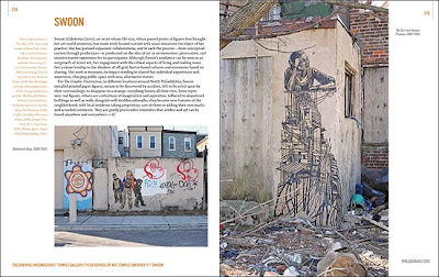
Swoon Wheatpastes in North Philly

Drive By Press Block Party


What else is inside?!
  • Foreword by Judith K. Brodsky
  • Introduction: This Could be the Start of Something Big by Teresa Jaynes
  • The Graphic Unconscious or the How and Why of a Print Triennial by José Roca
  • Print and the Public Sphere by Sheryl Conkelton
  • Print in Translation: The Graphic Unconscious at the Philadelphia Museum of Art by Shelley R. Langdale
  • Virtually Universal: Printmaking as a Tool by John Caperton
  • History Repeats: Reflections from Moore College of Art & Design by Lorie Mertes
  • Transforming the Known into the New: Pennsylvania Academy of the Fine Arts and Philagrafika 2010 by Julien Robson
  • In and Out of Print: Artist Projects in Historical Collections by Caitlin Perkins
  • Printmaking: A Colony of the Arts (2006) by Luis Camnitzer
AND MORE!!!

Stay tuned for details about ordering online and special offers! To reserve your copy, email info@philagrafika.org or call Rebecca Mott 215-701-8057

Friday, January 28, 2011

Common Press Turns Five!


On January 17th, Philagrafika headed over to West Philly to celebrate the 5th anniversary of Common Press, the letterpress printing studio located at University of Pennsylvania (and one of our favorite places). It was founded on January 17th, 2006, the 300th anniversary of Benjamin Franklin's birth!


The night was laid back and festive! Friends and fans gathered and watched as Matt Neff, master printer and print shop manager, assisted eager guests in printing a free commemorative keepsake letterpress postcard for folks to take home.


For more information about the goings-on at Common Press visit their website at www.design.upenn.edu/commonpress.

Thursday, October 14, 2010

Picturing the West, Yokohama Prints 1859-1870s

Complete Detailed View of Yokohama Street and the Miyozaki Quarter, 1860. Utagawa Sadahide, Japanese, 1807 - 1873. Color woodcut triptych, Öban tate-e triptych (19--21): 14 1/2 x 30 inches (36.8 x 76.2 cm). Philadelphia Museum of Art, Gift of Eli Kirk Price, 1950.


by Caitlin Perkins, Philagrafika Program Manager

Japanese woodblock prints always seduce me—their luscious rich color, the intricate carved details reenacting an artist’s brushstroke or a delicate wash of color. No matter the context in which they are shown, they never cease to delight me, so I was very excited to go see the Picturing the West, Yokohama Prints 1859-1870s at the Philadelphia Museum of Art (PMA).

Not as achingly perfect as the secluded world of the Ukiyo-e prints populated by Hokusai, nor perhaps as exquisite as the prints by Yoshitoshi, these Yokohama prints were produced for the mass market in Japan the moment treaties opened the country to the world. In viewing this body of work, it is very clear how these prints are the equivalent to a contemporary postcard, snapshoti or cover of a tabloid magazine.

The Ukiyo-e tradition developed in capital of Japanese Edo (modern day Tokyo). This rich tradition of woodcut has a highly stylized pictorial system of depiction, and like the Ukiyo-e, the Yokohama prints used a very specific formula. The system of production was divided into: publisher, artist, woodcarver, and printer; and they standardized the size of the woodblock and paper–printing images in sections, to speed the production in order to meet the rising demand for these prints.

The first Portuguese merchants landed by accident in Japan in 1542, followed by other western visitors including many Christian missionaries eager to convert the easterners, and as a direct result of the cultural clashes with the influx of these foreigners, Japan’s ruling Samurai class closed the country’s border in 1639 so that no foreigners could enter and Japanese citizens were forbidden to travel abroad.ii

The Yokohama show sets the scene for the opening of Japan to the West – the Tokugawa Shogunate remained in power until 1868 and negotiated the treaties, they were still in power during this time – the prints providing nearly a visual play-by-play, while the exhibition text explains the finer points of the politics of the day.

The Shogunate system in Japan had created a stable society with five classes. At the top were the Samurai, followed by peasants, artisans and merchants, but towards the middle of the 19th century, the Tokugawa government, which had held power for several centuries, was losing its hold. It had fallen victim to a steadily declining financial situation, several natural disasters, and a growing merchant class (hmm, this sounds vaguely contemporary). Conservative groups with anti-government, anti western feelings began vying for power.iii

Japan was coerced into signing treaties with five nations: Russia, United States, France, England and the Netherlands in order to open up trade and landing rights for foreign ships. When the borders were reopened to westerners in 1859, the print publishers were ready to fill the demand for information about the newly arrived visitors. From 1859-1861 there were some 500 different print images designed by 31 artists, produced by 50 or more publishers in Yokohama. These prints were frequently made in sets of five in a nod to the five nations who signed treaties with Japan.

The two galleries at the PMA are filled with almost 100 examples of Yokohama prints which document this cultural encounter of people, geography, architecture, port activity and trade. The works in the exhibition are grouped by subject matter – portraits of westerners, commerce, maps and leisure/entertainment activities. Each print contains a codified system of marks, which I had never seen broken down and identified, as it was in the wall text at the PMA. In each image, in the top right is the title of the print, below this is the censor’s mark, and at the bottom is the publishers seal, finally the artist’s name appears on a mark on the left of the image. There were often other bits of text (vocabulary glossaries that provided transliterations of foreign words into Japanese and other commentary) in the images swirling about the picture like a tabloid magazine cover bustling with activity.

A Russian Couple Holding Hands, 1861. Utagawa Kunihisa II, Japanese
, 1832 - 1891. Color woodcut, Öban tate-e: 14 1/4 x 9 3/4 inches (36.2 x 24.8 cm). Philadelphia Museum of Art, Purchased with the Lola Downin Peck Fund and with funds contributed by Lessing J. Rosenwald, Mr. and Mrs. Robert A. Hauslohner, Dr. Emanuel Wolff, the Derald and Janet Ruttenberg Foundation, Mrs. Edward G. Budd, Jr., and David P. Willis, 1968.

An example is the “Complete Detailed View of Yokohama Main Street and the Miyozaki Quarter” of 1860 by Utagawa Sadahide. This is a large format print made of smaller printed sheets glued together – taking advantage of the system of printer and carver. It is much like an illustrated tourist map, with its hovering point of view showing the whole city and its details of commerce and daily life. This map includes a very striking American flag in the lower left, indicating where the foreigners stayed within a walled area of the city. The “map” is pocked with hovering red signs indicating local businesses, tea houses and more, reminiscent of advertisements on diner placemats for local businesses.

These mass produced prints have delightful characteristics and misprints resulting from their production. I love the clumsiness with which the artists stylized the unfamiliar dresses of western women to create beautiful patterning. Similarly, in facial features such as facial hair, in one particular portrait from 1861 by Yoshitsuya of an Englishman with musket - his beard rendered like the stylized curls of a Chinese dragon dog.

An Englishman (with a Musket), 1861. Ichieisai Yoshitsuya, Japanese, 1822 - 1866. Color woodcut, Öban tate-e: 14 3/8 x 9 3/4 inches (36.5 x 24.8 cm). Philadelphia Museum of Art, Purchased with the Lola Downin Peck Fund and with funds contributed by Lessing J. Rosenwald, Mr. and Mrs. Robert A. Hauslohner, Dr. Emanuel Wolff, the Derald and Janet Ruttenberg Foundation, Mrs. Edward G. Budd, Jr., and David P. Willis, 1968.

A Frenchwoman and a Dutchman,1860. Ochiai Yoshiiku, Japanese, 1833 - 1904. Color woodcut, Öban tate-e: 14 1/8 x 9 5/8 inches (35.9 x 24.4 cm). Philadelphia Museum of Art, Purchased with the Lola Downin Peck Fund and with funds contributed by Lessing J. Rosenwald, Mr. and Mrs. Robert A. Hauslohner, Dr. Emanuel Wolff, the Derald and Janet Ruttenberg Foundation, Mrs. Edward G. Budd, Jr., and David P. Willis, 1968.


Often the artists were documenting places they had never seen, and incorporating architecture of far away lands like Paris – and the images take on a peculiar flattening but continue to use that hovering angled point of view.

A few examples show gorgeously clumsy typography of western words, juxtaposed against the tight calligraphy of the Japanese text. In “The Great French Soullier Circus and Equestrian Acrobatic Show” of 1871 by Utagawa Yoshiharua, a wonderful poster advertising a circus with horses and acrobats, “Soullier” is awkwardly carved as the artist struggled to form the western letters.


The Great French Soullier Circus and Equestrian Acrobatic Show,1871. Utagawa Yoshiharu, Japanese, 1828 - 1888. Color woodcut triptych, Öban tate-e triptych: 14 1/2 x 18 3/8 inches (36.8 x 72.1 cm). Philadelphia Museum of Art, Purchased with the Lola Downin Peck Fund and with funds contributed by Lessing J. Rosenwald, Mr. and Mrs. Robert A. Hauslohner, Dr. Emanuel Wolff, the Derald and Janet Ruttenberg Foundation, Mrs. Edward G. Budd, Jr., and David P. Willis, 1968.


Walking through the galleries, I realized that these prints were much like engravings in a natural history, or an anthropological book. For example, one of the woodcuts is a print about a Dutch couple, and includes a text that describes the Dutch as a people with white skin, red hair, high noses, and round eyes. It goes on to say they wear a great deal of clothing, are intelligent and superior to rest of world in surgery and finally they write horizontally and eat a wide range of fowl and meat.

Another print spoke about people of barbarian nations from 1861, and I realized that we (the westerners) were their barbarians. These truly resembled so many images of “savages” that I’d seen depicted in texts from the 18th and 19th centuries by western artists.

I found this show particularly interesting in the context of what is going on in Japan today in light of economic downturn, earthquakes, and political instability. The Japanese are reeling from a huge unemployment rate, which was recently 15.7%, very close to that of the United States.iv The employment system where men went to work for one company for life has disappeared, and in its wake seems to be a backlash against the foreigners perceived as taking their jobs. Martin Fackler’s article “New Dissent in Japan Is Loudly Anti-Foreign” describes a new type of ultranationalist group in Japan trying to win attention through protests. Just last December the Japanese group Zaitokukai (the equivalent to the US Teaparty) were picketing outside a Korean kindergarten wearing slogans saying “Expel barbarians.”v

This Yokohama show offers views of a time when Japan was opening, rather than shutting down cultural exchange, and perhaps it offers all of us an alternative of seeing the “other”.vi

More information

Picturing the West: Yokohama Prints 1859–1870s
August 28, 2010 - November 14, 2010
Curator, Shelley R. Langdale • Associate Curator of Prints and Drawings
Berman and Stieglitz Galleries, Philadelphia Museum of Art
You can see the prints online, if you are not able to see them in person by visiting:

Also visit, participating Philagrafika 2010 artist collective Young Hae Chang Heavy Industries’ exhibition “Down in Fukuoka with the Belarusian Blues” inspired by the story from a translation from French into English and a transposition to the present of a sworn deposition made on July18, 1873, by an 18-year-old French poet, Arthur Rimbaud. Fukuoka happens to be the largest port city, geographically closest to both Korea and China. It’s a small world.

http://www.galleryhyundai.com/teaser/


i Umetaro Azechi, Japanese Woodblock Prints Their Techniques and Appreciation (Tokyo: Toto Shuppan Co., Ltd. 1963)
ii http://www.japan-guide.com/e/e2128.html
iii http://www.japan-guide.com/e/e2128.html
iv New York Times, http://www.nytimes.com/info/japan/ Japan By Martin Fackler, Hiroko Tabuchi
v ibid
vi New York Times, http://www.nytimes.com/2010/08/29/world/asia/29japan.html New Dissent in Japan is Loudly Anit-Foreign By Martin Fackler

Thursday, August 19, 2010

Space 1026: Today is Our Day


The front cover, designed by Mike Gerkovich and Bonnie Brenda Scott

Recently, we had a copy of Space 1026's awesome new book Today is Our Day floating around the office. It's been getting a lot of exposure on the blog circuit, and for good reason. It was hand printed and bound at Space in an edition of 150, with each page featuring artwork from a different member.

Spread by Matt Leines and Bill McRight

The coolest part about the book are the gatefold pages dispersed throughout the book. Pages unfold into sprawling compositions, with some pages being specially cut to create a layered effect. Already a hefty-sized book at 12.5 " x 9.5 ", the book unfolds to a wingspan of 38 "!
Top Spread by Ben Woodward and Anni Altshuler. Bottom Spread by Leah Mackin

There are plenty more pictures available on the Space 1026 Flickr, but definitely check this one out in person. It's a steal at $50 from the Space 1026 Store, and it makes a fine addition to any artist book collection.

Oh and here's the list of participating artists: Michael Gerkovich, Bonnie Brenda Scott, Matt Leines, Alex Lukas, Bill McRight, Crystal Stokowski, Jacob Marcinek, Ben Woodward, Anni Altshur, Leah Mackin, Emilia Brintnall, James Ulmer, Kay Healy, Roman Hasiuk, Justin Myer-Staller, Clint Woodside, Kyle Schmidt, Thom Lessner, Chris Kline, Jason Hsu and Andrew Jeffrey Wright

Tuesday, June 29, 2010

Dennis McNett Shreds the Barney's Windows

Brooklyn woodcut artist and SGC Take Over-er Dennis McNett has set his sights on a new dragon to slay: the world of fashion... or at least the world of fashion window displays.

McNett just installed 50 feet's worth of block print madness inside the windows of Barney's on Madison Avenue, between 60th and 61st Streets. The installation includes several of McNett's huge banner prints of patterns and creatures inspired by the high-energy of the late 80's punk and hardcore music. Along with the insanely intricate relief prints, he's designed several masks: animals, skulls, animal skulls, wolves, bats, and of course, WolfBats.

There's something really strange yet completely appropriate about the combination of stark white-emaciated mannequins dressed in high end fashion with these intense renderings of crazed beasts and other imagery inspired by mythology, punk rock, and skateboarding. They seem to be total opposites on paper, yet complement each other beautifully when seen in person.

Speaking of in person, word on the street is to check these windows out at night for the full effect, as they've been professionally lit. Check out more of Dennis McNett at wolfbat.com.

-Dan Haddigan

Monday, June 28, 2010

Cannonball Press: Woodcut Thrill Ride!

If you've been following Philagrafika at all, you know two things: we're all about pushing the boundaries of the capabilities of the printed image, and that one of our consistent allies is Cannonball Press, the Brooklyn-based collaboration of artists Mike Houston and Martin Mazorra. So naturally, when Cannonball Press comes up with a project like "Woodcut Thrillride", we take notice:

"...We’re combining hand-carved woodblock prints made on a 1938 Vandercook proof press with state-of-the-art 3D digital animation software. Old school meets new school in the inimitable Cannonball monochromatic style. We’re teaming up with acclaimed jazz saxophonist John Ellis, his band Double-Wide and accomplished animator Eric Knisley to create our own 3-minute long woodcut Petrushka."


The project does have it's obstacles, and as is an inevitability for any artist, that obstacle is lack of funds. Cannonball is seeking $3500 by August 31 in order to produce the video, and they need your help.

Of course, it's not like Cannonball Press to take your money without giving back, so for your contribution, you will receive "perks" that correspond to your level of donation: For a $20 donation, you'll get a signed copy of John Ellis's album "Puppet Mischief." For $30, you reveive a Double-Wide letterpress playbill, for $40 a Double-Wide letterpress broadside and for $60, a souzasaxophone 3-color woodcut. Everyone wins.

For more about the project, and to donate, visit http://projectsite.unitedstatesartists.org/project/woodcut_thrillride_animation

-Dan Haddigan

Tuesday, June 22, 2010

Summer Solstice Benefit 2010 Featured Artists: Kaitlin Mosley and Katie Tackman

by Marianne Bernstein


If you haven't met the two K's of Silicon Gallery yet, you're missing out on a big treat. Don't be fooled by their age (20's) or total adorableness--they are the backbone of this esteemed digital printmaking studio, a Mecca for Philadelphia artists and printmakers. Kaitlin Mosley and Katie Tackman are also excellent photographers and, like horses at a racetrack, are pawing at the gate ready for a big breakout. I've watched their evolution over the years, first at Silicon, marveling at their patience and printing expertise, and more recently as artists and friends. I believe they have discovered recently what many of us mid-career artists slowly figure out-- that encouraging one's friends and contemporaries oftentimes is exactly what's needed to take oneself as an artist more seriously, to be less self-critical, while moving forward...


Kaitlin and KT's photographs share many qualities. They both shoot film. Mostly set in natural settings, with water nearby, each image can be read as both a portrait and a landscape. They are serene, timeless, and nostalgic. The viewer often feels as if they have stumbled upon a private moment, a Cartier-Bresson "decisive moment" of harmony and balance, which a second later will change completely.

"Bambi"- Kaitlin Mosely

"Olomouc"- Katie Tackman

Katie Tackman

For Summer Solstice, Kaitlin contributed "Ship" a haunting image of a sailboat adrift in the fog, where water and sky are almost indistinguishable. KT created a stunning body of work while traveling recently in the Czech Republic, using only a Holga camera, of families on a lakeside vacation. "Olomouc", her contribution to Solstice is perfectly composed and intensely felt; a family outing so familiar, sad, haunting, and lovely, it takes my breath away.

"Ship"- Kaitlin Mosely

Recently I spoke with them about their work:

MB: When did you first pick up a camera and why? What did you photograph?

KAITLIN: I don’t remember the first picture I ever took, but guessing by the age of my siblings in the photos I must have been around 7. I still have copies of the photos I took of my sisters standing on my bed posing for glamour shots that I styled. They couldn’t have been more than 5. My mom was always photographing us (I am one of 5 kids, have a twin brother, two sisters who are 1 and ½ years younger than me and then a single sister who is 6 years younger than me.) and one of our favorite things to do would be to sit on the couch and look at photo albums with my mom as she would point us out in the pictures, younger versions of ourselves. My first camera was either my pink Vivitar (110 film!) or the Kodak instamatic (210 film), then I moved on and learned how to load actual film myself.

KT: I started photographing in high school because I was kind of an outsider. Growing up in Connecticut was very different than my life is now. I was surrounded by people who were more concerned with money and a certain social status, which made me want to escape. But the amazing thing about growing up in New England was nature is always around you. I would escape to the water or the woods and photograph my observations. Some of my first Polaroid’s were taken in Connecticut and I still remember every scene from that day because taking photos widens my senses making me super aware of details.

MB: What do you photograph now- and why?

KAITLIN: I photograph my loved ones and the places we go, or the places I go. I prefer to shoot with my cameras, which are a Minolta x700 and my Yashika for medium format. It’s just what I know, and what I like and enjoy.

KT: I photograph now because it is one of the only things that excites me about life. I am a very quiet person so I think my photography gives me a platform to speak through my eyes. I also use photography as a way of meeting people when searching along the Schuylkill for subjects to photograph. I mainly use Polaroid and instant film because I love the immediacy and the colors it produces. I have started using sepia toned Polaroid and experimental film made by the Impossible Project, which is fun to experiment with and get a different effect each time.

MB: Which photographers have influenced you?

KAITLIN: Francesca Woodman, and Wynn Bullock.

KT: Hellen van Meene, Man Ray, and William Eggleston

MB: What are your other interests? Do they affect your photographs in any way?

KAITLIN: My interests are nature, family, and friends. I like getting out of the city and I like camping a whole lot. I like being with the people I care about. I wouldn’t be able to photograph strangers the way some people do.

KT: My two passions are photography and sailing which both give me a sense of freedom. I grew up sailing and worked on a Tall Ship for a year after graduating college. The ocean both excites and scares me at the same time. I would like to explore that idea through my photographs someday. I have also been known to rip it up on the basketball court, which really has nothing to do with photography but it is just as fun!

MB: How has working at Silicon affected your photography? Have you influenced one another?

KAITLIN: I have grown fond of color since I have been at Silicon. I was primarily into black and white, in the darkroom in college and working here has definitely influenced my appreciation of color. I think you could say that I am sensitive to color, which makes me a careful and good printer for others. I also care about others and what they want to achieve with their art, so I try to let myself be a bridge for them into this process.

KT: When I started working at Silicon I became immersed in the art scene in Philly. I have met so many artists but more importantly created relationships with them outside of work. We try to support all the artists who come into the shop and in turn they support all of our work. Kaitlin, Steven, Gus and I all go to each other’s shows and we are constantly talking about our ideas and our experiences creating art. Kaitlin and I look at each other’s work and give each other advice or tell each other about shows. I think it is interesting that we have a similar style of photography but before we even knew each other. Not really in subject or technique but in feeling. I try to make my photos look timeless and I think Kaitlin just does that naturally. I admire her for that and for the personal content in her work.

MB: If the sky were the limit, what would you be doing now?

KAITLIN: I would be camping, with my loved ones, preferably on the beach. And I would be taking pictures.

KT: I would like to be traveling, exploring in the Czech Republic. In college I studied abroad in Prague and traveled throughout the country. The escape from the regular academic lifestyle and traveling allowed me to photograph for fun again. I came back with some amazing photos, which I did not pre-visualize; they just came out of me while I was exploring the pools and lakes in the country. Now I try to recreate that same imagery that I saw there.

MB: Why is Silicon special to the Philadelphia print community? What is it that Silicon offers that you can't find elsewhere here?

KAITLIN: Silicon is the information Hub for the art scene in Philadelphia. We are involved with most projects and support most artists. We do our best to be accessible to all who have an interest and we help spread the word of what is going on to those new to the city who are interested in getting more involved in the arts. There is always a dialogue here and it is always about helping others achieve their goals and meet their challenges. I think we make a lot of people happy with what we do. We print for so many people from all around, from printing paintings from William Egglestons’s cousin somewhere outside of Memphis, Tennessee who was very happy to be working with a “Kaitlin, a good southern name”, to the local and fabulous Zoë Strauss, to whom I must say 143…

KT: I think Silicon is a place where artists can get high quality digital prints and work with people who actually care about the end product. We are all artists so we know how much work our customers put into their work, so we try to give the same amount. This shop is important to the Philly art community because it connects so many people. Rick does projects with Philagrafika, Fresh Artists, Cindy Ettinger, and many other local non-profits, usually as a favor or just to help support their causes. I admire that about this company and feel good about helping out other artists in the community. Also the late Dog was what made this shop different from others. He was our mascot and friend; we will miss him dearly!

Check them out. And thank you so much, Rick DeCoyte, Silicon Gallery and Fine Art Prints for all that you have done for the Philadelphia art community and for Philagrafika!