Showing posts with label printmaking. Show all posts

Saturday, March 17, 2018

The Graphic Unconscious Exhibition Catalogue


The Graphic Unconscious Exhibition Catalogue is now available here: PGKA GU


The Graphic Unconscious Catalogue is a reference for the expanded field of printmaking featuring work by forty artists and collectives, working in a variety of media from traditional print to multi-disciplinary practices that were featured in the exhibition of the Philagrafika 2010 festival— Philadelphia’s international festival celebrating print in contemporary art that was held from January 29 through April 11, 2010. 

Essays by: José Roca, Sheryl Conkleton, Shelley Langdale, John Caperton, Lorie Mertes, Julien Robson, Caitlin Perkins and Luis Camnitzer with Photography by Greenhouse Media, Rebecca Mott and the artists.

Featured Artists:

Lisa Anne Auerbach, Eric Avery, Christiane Baumgartner, Erick Beltrán, Bitterkomix, Mark Bradford, Cannonball Press, Enrique Chagoya, Sue Coe, Julius Deutschbauer, Dexter Sinister, Dispatch, Drive By Press, Eloísa Cartonera, Art Hazelwood, Pablo Helguera, Orit Hofshi, Thomas Kilpper, Gunilla Klingberg, Virgil Marti, Paul Morrison, Óscar Muñoz, Pepón Osorio, Carl Pope, Qui Zhijie, Duke Riley, Betsabeé Romero, Francesc Ruiz, Jenny Schmid, Self Help Graphics & Art, Regina Silveira, Kiki Smith, Space 1026, Superflex, Swoon, Tabaimo, Temporary Services, Barthélémy Toguo, Tromarama, and YOUNG-HAE CHANG HEAVY INDUSTRIES.

* link to buy the catalog has been fixed

Sunday, November 25, 2012

Interview: Alex Lukas


With a wide range of artistic influences, Alex Lukas creates highly detailed drawings, subtly rendered prints, and complex 'zines. Moving between mono- or duo-tone and lush color, his work challenges the perception of the urban environment as a place of inevitable destruction. Though his landscapes can seem eerily foreboding and forsaken, the artist eschews the term "post- apocalyptic" for his work, preferring to leave the meaning behind his works open to viewer interpretation in a variety of ways. Lukas is a Philadelphia resident and member of Philadelphia-based collective Space 1026. His imprint, Cantab Publishing, has released over 35 small books and 'zines since 2001.

Recently Dan Haddigan talked with Alex about his ideas, his use of printmaking in contemporary work, and why superheroes don't seem to show up when you expect them to.

Dan Haddigan:  You have a very interesting and diverse body of work, incorporating a number of different techniques. Since this is the Philagrafika blog, I think the best way to start the conversation is for you to speak a little bit on your printmaking practice. I recall reading in an interview that you use a special silkscreen technique on your flooded-city pieces - the rendering of the water is all done by hand, and then silkscreened, correct? Do you ever re-use the same textures from one piece to the next? Can you discuss your feelings on the use of silkscreen techniques as a tool to produce a single image rather than a printed edition? What is your attitude, and your thoughts on printmaking in general, and printmaking as a tool to create certain effects?

Alex Lukas:  I try to use printmaking techniques where it is appropriate. I don't really consider myself a capital-P "Printmaker." I'll always consider myself a 'zine maker, since for a long time that was really my primary focus. When creating 'zines, I try to consider technique, form and the idea of editioning these printed objects-in-multiple.

That said, I have never taken a screen-printing class - so all of my knowledge came from observation, helpful peers and figuring it out myself. 


When I first started incorporating screen printing into my one-off drawings, the technique was heavily influenced by a lot of the posters and 'zines I had seen being produced in Providence, Rhode Island, where I went to college. Other than going to a few parties, I was never even tangentially involved in any of that Fort Thunder stuff, but I was really, really excited by the process of it - the use of transparent ink overlays especially. It is such a smart and economical way to produce color with just a few screens. When I realized I wanted to use this effect in my drawings, I couldn't figure out any other way than screen printing.

And, to me, that is still the key: using printmaking techniques for effects that I couldn't otherwise achieve. The screen-printed book pages that you are asking about usually involve a split-palette pull through an open screen - an opaque ink fading into a transparent over a partially masked-out cityscape. For many of my other drawings, I'll screen-print advertisements or murals - objects in the composition that I want present as distinct from my drawing. The water patterns I re-use many times, they are printed from photographs I find or take myself. The reflections of the buildings are painted into each work.


DH:  You've touched on what I think is one of the most exciting things happening within printmaking today. I think that the discipline is currently in the midst of an evolution, moving from something very structured and academic to a medium that’s more about experimentation and combining other media. Where in the past it’s been a tool to unleash multiples upon the world, now more and more artists are using print techniques in a much more fluid way. The fact that you regularly employ silkscreen techniques despite the fact that you've never taken a screen-printing class shows that you belong in sort of a "new school" of artists who learned the techniques second-hand and adapted them to your circumstances. (That’s not to say that printmakers haven't been experimental before, but now it seems extremely prevalent, more like the rule and less the exception.) You don’t have the onus of "the right way" floating above your head while you work, and I think it can be difficult for classically trained printmakers to steer away from that mindset. It really opens the door to a wealth of possibilities.

AL:  I agree - but I think this cross-disciplinary practice is really just the way people make artworks today in general, not just as it relates to printmaking. I like the idea of de-stigmatizing printmaking from a craft to just another tool like video or sculpture or performance. I think the idea of printmaking as a tool for craft and not simply another method of making work is outdated, but not everyone has come around yet. And, just for the record, I have taken some printmaking classes, just never a screen-printing class. I took a continuing-ed etching class and a letterpress class, and I'm very interested in those techniques, but screen-printing has always been the most attractive and appropriate method for my work.


DH:  In addition to the silkscreen drawings, you also do editioned prints, as well as run a 'zine publishing imprint. How do these works compare to your other work? Is it any more or less enjoyable than your mixed-media pieces or drawings? How important is it to your artistic process? Does the fact that you publish 'zines inform any other part of your work? Is there any connection between publishing others' work and appropriating published works (book pages) for your pieces?

AL:  I'm not sure I can quantify one as more or less enjoyable. All of it obviously comes from me - but I do consider them distinct bodies of work stemming from similar influences and interests. I used to get the comment a lot that I should add superheroes to my drawings - Superman flying through or something - but that doesn't really make sense to me. I get why the suggestion would be made, but it doesn't correlate with the reason I make those works. 


The drawings I make are intended (and this is a drastically oversimplified summation) as quiet reflections on violence and rebirth. The 'zines are generally collections of photographs, interviews or focused on the history of some obscure place. The superhero prints are nerdy one-liners. All of these things are interesting to me, feel important to make, and come from a similar place and set of experiences, but they have different goals, so I try not to cram all of these intentions into one body of work.

Like I discussed before, there is a lot of technical overlap and influence as well. I'm not sure if there is a correlation between publishing and appropriating, other than the natural impulse to collect printed stuff - books, 'zines, posters - it all accumulates together. I really like printed material.


DH:  Just because you have a lot to say doesn't mean you need to say it all at once. Good artists know how to edit themselves. It's important for artists to have ideas outside of their main body of work that occupy some mental real estate. I find that I have my best ideas when I'm focused on something else. It's interesting to me the way that two separate entities can overlap subconsciously. The fact that your superheroes are existentially walled off from the disasters they can help alleviate or prevent makes both bodies of work all the more interesting.

AL:  Yes, I think the delineation of the work is good, but it has also sometimes been a hindrance. It has gotten easier recently, but for a while, when an opportunity would come up for a show or an illustration project, I would need to ask very specifically what work of mine the person expected.

Very recently I've begun to try to break down some of the walls I've built up for compartmentalizing my own work. I'm increasingly interested in trying to incorporate some of the photography I do into the work I exhibit. I mean, it has always been integral for research and reference, but I've started to show some new drawings alongside diazotypes (blueprints) or unique photocopies that come directly from my reference photography. I'm really excited about the direction these pieces are going.


DH:  I saw a recent group show you were in at Extra Extra Gallery in Philadelphia, which I believe was their last show, appropriately enough. You had an installation set up, including a large white skeletal structure for displaying your framed pieces, flanked by potted plants and fluorescent lights. What spurred your work toward a more installation-based approach, and is this a direction you will continue with in the future? How do the structure and the plants push the work further, in your opinion?

AL:  I was really excited with the installation at Extra Extra. For a year and a half I have been working on a 'zine series titled OF NOTE. Each issue is one or two 11" x 17" photocopied pages folded into quarters and dedicated to photographs I've taken and collected together under a simple thematic umbrella: vans in the snow, a graffitied plant, hand-painted couches and so on. Issue #12 was just released. Sometimes it is a set of photographs taken in a few minutes, sometimes it takes a year to compile. Issue #7 was dedicated to fluorescent lights and the spaces they occupy - loading docks, vacant storefronts - generally commercial spaces. My favorites from this collection were fluorescent lights left on inside of vacant storefronts. As I've been hinting at ideas of commerce in my work for a while now, I decided to try incorporating this type of lighting into my installation at Extra Extra. The structure itself is a pretty direct extension of structures I've been building to hold my large drawings for a while, so it seemed appropriate.


DH:  For all of its blank, dull evenness, fluorescent lighting can be very expressive. To use it as a sculpture or installation medium and to use it to light artwork is to make a very distinct decision about presentation, especially in the capacity you speak of. It's a very convenient and clever way to make that connection to commercialism without being too overt (the same goes for the billboard-inspired structures). In my opinion, when used to light artwork, fluorescent lighting has a way of making it look sort of ghastly, as opposed to the enhancing qualities of halogen lighting.

AL:  Fluorescent lighting has been a pretty well-trod path in contemporary art. Simon Boudvin's Concave series is one of my favorites. Robert Irwin. Dan Flavin, obviously. 
I'm not sure I agree with your characterization of fluorescent lights as making artworks look ghastly, though. I think a lot of galleries that I'm really excited about have exclusively fluorescent lights, but I take your point that it is a different way to view work. 

That line between the familiar and unfamiliar, between ease and disease, is really important to me. I'm really interested in pursuing that more through the structures and lights that hint at commerce but re-contextualize it. That is a similar impulse, in my mind, to depicting these scenes of destruction in a fashion that references the idealized depiction of our country in 19th-century American landscape painting.


DH:  Your subject matter is obviously pretty dark. However, the scenes you depict always have a certain light to them. Your color palette is generally neutral, the weather is often overcast, but it's not night time. Although humans are not depicted, there are still traces of life. The word apocalypse is thrown around pretty liberally, although not many people are familiar with the original meaning of the word - it relates to the permanent triumph of the forces of good over the forces of evil, the revelation of truth, the "lifting of the veil." Is this something that you think about when you approach your work conceptually? How much of this is a conscious decision in your work? Why do you choose to focus on this type of subject matter?

AL:  I like that - "lifting the veil." That is much more interesting and appropriate than the term "post-apocalyptic," which people often use in relation to my work. I get it: it is the most accessible descriptor for what I draw, but I think that focus is wrong for what I make. And I think in articulating why I dislike that term, I am able to describe my intentions better. These drawings are non-narratives - they are not meant to tell a particular story nor have a sense of a specific moment. So much of the fascination with end-time "post-apocalyptic" imagery gets burdened by particular descriptions of "what happened" - which often devolves into vampires and zombies or cautionary tales about global warming or nuclear proliferation. Some of those fears are more valid than others, but either way, I'm not trying to be a didactic picture-maker. I'm trying to take the specificity out of the image and focus instead on these contradictory feelings of anxiety and peace; hints of violence surrounded by rebirth through these placeless landscapes. These themes and contradictions are much more interesting to me.


The book pages are obviously not "place-less;" they all depict American cities, but by using older imagery I'm able to engage with ideas of false histories. The source of these book pages are usually coffee-table books from the 70s or 80s, so they generally depict skylines that are different from how they appear today. Sometimes buildings depicted have been demolished, sometimes I'll cover up other structures, sometimes the names of defunct companies still adorn facades. All of this is really, really interesting to me and takes away from the simple notion that this is a "warning of one possible future if we don't 'shape up'."


DH:  It's human nature to analyze an image and relate it to the present - we look at something and decide if it's now, the future or history, and then the next logical step is to construct a back-story for what we see. I think you do a great job of reducing specificity, but the instinct to contextualize will always be there. With your work, you seem to have a specific goal in mind. Do you think it detracts from the work if it operates on a narrative level? Are you troubled when people mistake your work as a warning message? You mentioned that using older images is a way to create disassociation; are there any other specific steps you take to achieve this? 

I'm very interested in the conceptual thinking and the depth of intellect in your work. Have you, or would you ever, consider doing any sort of written companion to your work?

AL:  I'm not sure about a written companion to the work. I feel much more comfortable dealing with these issues visually than through writing. I think it's just easier and more fun for me. 

I understand that the work will operate on a narrative level; it is a landscape painting, after all. I just ask the viewer to provide that narrative for themselves, starting with a set of cues I give, and then I hope the more they look at the work, the more they will question the narrative they initially had. 

I'm always excited to find spray-painted graffiti written by high-school kids under bridges and on rocks. I love that method of communication because it is so hyper-specific ("Steve was here"), in that it lets you know exactly what happened ("Steve was here"), but at the same time, it is totally vague (Steve who? When was Steve here? Who was Steve with? Why did Steve decide to commemorate his arrival at this spot? Where did Steve go from here?). The more you think about it, the less specific it gets. I think that process is a good parallel for what I try to do with my drawings. 


Alex Lukas was born in Boston, Massachusetts in 1981 and raised in nearby Cambridge. He creates both highly detailed drawings and intricate Xeroxed 'zines. Lukas's imprint, Cantab Publishing, has released over 35 small books and 'zines since its inception in 2001. His drawings have been exhibited in New York, Boston, Philadelphia, Los Angeles, San Francisco, London, Stockholm and Copenhagen as well as in the pages of Swindle Quarterly, Proximity Magazine, the San Francisco Chronicle, the Village Voice, Philadelphia Weekly, Dwell magazine, Juxtapoz and the New York Times Book Review. Lukas is a graduate of the Rhode Island School of Design and now lives in Philadelphia, PA.

Alex's most recent projects include VIID and Underneath Providence. Click on the links to discover more of Alex's work. 

Click here to see behind-the-scenes images of Alex and Amanda D'Amico creating the 2011 Philagrafika Invitational Portfolio Print.

Dan Haddigan is a Philadelphia-based artist, writer and co-founder of Dirt is Dirt, a curated, submission-based, online art magazine. Discover more about Dan's work by visiting danhaddigan.com

Tuesday, June 16, 2009

Interview: Eric Avery


Portrait of the Artist as a Young Doctor, 1974. Black and white photograph.


Some of us who work with art, when confronted with a difficult situation, force ourselves to realize that, despite the magnitude of the problem, there are more crucial things in the larger scheme of life. Art is important, but it does not save lives.


Well, sometimes it does: Eric Avery's is one of those rare cases in which an art practice is intimately linked with a life-defining situation. While often artists have another profession, it is rather unusal to have a practicing doctor that works with equal passion on art-making. In Eric Avery’s work, two professions that appear to be radically different come together naturally within the same practice. Trained as a doctor in a rather difficult time in American history, Avery started early to use his artistic output as a way to raise awareness towards pressing health issues. Ignorance can equal death, as one of the eary mottos by Act Up warned. Or, as he put it in a print done about a refugee camp in Somalia, “Food is medicine.” Some of his prints have a distinct political purpose. As we all know, the official treatment of disease is informed by political agendas that vary in relation to the social group that is endangered. Since the late seventies, Avery has been an active printmaker. In the last few decades he has done performances in art settings in which he tests visitors for HIV/AIDS, Hepatitis C, and other diseases. His prints hark back to the history of printmaking as a way to spread a message and to reach a larger audience in public space. His long career can be looked up on his aptly titled blog, DocArt.com.


This interview was done via email.


J. Roca.


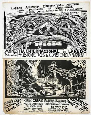
Amnesty International Poster, Laredo, Texas. Xerox, 16" x 11"

Jose Roca: You studied Medicine and are a practicing doctor. How did you become interested in art? When did you start making artworks and participating in exhibitions?

Eric Avery: I was cutting linoleum blocks in Pecos, Texas when I was 13, printing note cards that were sold in a yarn shop on Highway 80. I'm still cutting linoleum 47 years later. Printmaking has been a curse. I majored in art at the University of Arizona. I had a terrific printmaking teacher/mentor Andrew Rush. This was the Vietnam War time. My draft number was 7, so I would have gone to the war if I hadn't figured out how to continue my education. Andy said I always talked about being a doctor. He suggested I give it a try. I didn't think it was possible because I was an artist. Andy said I would always make prints and suggested I go have an interesting life and that my prints would fall like dandruff on my trail.


I took some science classes. I loved Biology and didn't have to take Calculus. I did good enough to get into medical school at the University of Texas Medical Branch in Galveston, Texas. This was during the early days in the development of Medical Humanities in the United States. I made prints all through my medical school years in Texas and then in New York City during my psychiatry residency training. In 1972, I silkscreened all 700 of my medical school's yearbook covers. My first exhibition was after medical school in 1974.


Las Dure Refugee Camp Certificate, 1980. Woodcut, 12" x 16" edition: unique.

My first real woodcuts were made in Somalia, in a big refugee death camp in 1979 and 1980. If I didn't make prints in that place, I think I would have cracked. When I returned to Texas, I left the practice of medicine. I worked through all the death with my printmaking and had an important exhibit, "Images of Life and Death," in 1982. During this time, I added papermaking so I could print from three-dimensional wooden templates.


I've been making prints and paper and exhibiting regularly since 1982. In 1992, I returned to practicing medicine and became a psychiatrist specializing in caring for people with HIV/AIDS. I would have cracked during the really bad AIDS times if I didn't make prints. Cutting wood and linoleum, hand-rubbed printing, beating paper pulp from my work shirts, pressing paper with my hydraulic press- all of these physical acts move trauma from the brain out through the body. Printmaking is good medicine if you've got a lot of distress and emotional pain. The prints can be hard to look at and live with. They are almost impossible to sell. I've made a lot of prints related to HIV/AIDS. A bunch of my medical-related prints are in the ARS MEDICA Collection at the Philadelphia Museum of Art. They are a part of the print history of the AIDS pandemic.


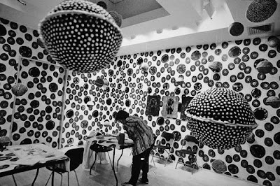
Healing Before Art: Public HIV Testing Action

Installation at Mary Ryan Gallery, New York City, 1994

A clinical art space to be used for the public HIV testing of art world representatives (artists, art dealers, collectors, curators).

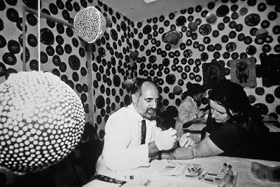
Here, artist Sue Coe’s blood is drawn by Phil Muskin, M.D.

JR: Your work is often performance-based, doing medical tests in the context of an art gallery. Is the main intention of the work primarily to raise awareness of pressing health issues?

EA: I've used a lot of the print forms but I was always working to get the prints off the walls and connected to the life I was witnessing and living. After working in Somalia, I quit practicing medicine and didn't see patients for eleven years. I lived on the Texas-Mexico border and worked to help Central American and Haitian refugees fleeing for their lives. Their human rights were being abused by U.S. immigration policy. I made some really good prints about the war in Central America and about how I felt about my country.


Sixteen years ago, when my friends began to die in Houston from AIDS, my life turned back to the practice of medicine at my old medical school, The University of Texas Medical Branch in Galveston, Texas. I've worked as a psychiatrist in the HIV Clinic and on the medical wards since then and my prints, print actions and installations have been about health matters.


At UTMB, the Institute for Medical Humanities had developed into a multidisciplinary humanities program. I'm the visual artist on the faculty. One day of my week has been protected for me to work on the connection between visual art and medicine- to reflect upon what I do in my clinical practice.

JR: A practice that involves art and medicine would seem a sleight of hand, but it seems to have come naturally to you.

EA: It might be so now, but it wasn't thirty years ago. I've always thought that the relationship had something to do with space. I used photography to look at the literal spaces of healing. As my artistic and medical practices grew, I was able to ask art museums wanting to exhibit my work if I could create healing spaces in their museums. I flipped functions. Printmakers are always working with reversals. Several anthropologist friends helped me understand liminality and the neither/nor.


Allen Kaprow's blurring of the relationship between art and life was an inspiration. Warhol did it. It's an old story. I just blurred the line between visual art and medicine. I used my prints in clinical art spaces where medicine was practiced in the aesthetic dimension. Doctors practicing medicine in an art museum- it's a subversive practice in liminal space. Each art/medicine action has had an educational and instrumental purpose. A number have been done on World AIDS Day. They also raise conceptual questions about the relationship between visual art and medicine. I'm really proud of the questions my art/medicine actions have raised about the function of art museum and gallery spaces. Wouldn't it be fantastic if you went to an art museum for health care? I have only a small audience, but the print form, historically connected to social content and information dissemination, works for what I've tried to do with art/medicine.

JR: Speaking of dissemination, we are on the verge of the first pandemic in the new millenium. What are your ideas for Philagrafika 2010?

EA: Your blog posting of the Poli/gráfica de San Juan was an inspiration. Miler Lagos’ woodcuts on tree stumps led me to propose text woodcuts on The Print Center toilet seats (that would imprint bottoms) perhaps something related to HIV risk reduction. Jose Carlos Martinot’s printers in palm trees- why not health-related information on toilet paper, or printed wallpaper in front of the urinals?


I'm also excited about my proposal of prints depicting wounded Adam and Eve on the wall of The Print Center. These 3'x6' linocuts of Adam and Eve (via Durer, Cranach's first couple) will have them being attacked by vectors and modes of transmission of Emerging Infectious Diseases. The snake will be coughing Avian Flu. Title of my piece might be: "So Who Needs The Snake In Our Garden Of Eden." From these key index images I'll have other printed and photographic images that relate to the various infectious diseases.


And I am trying to conceptualize a small booklet or pamphlet that will work with the prints. When I last wrote to you I remember writing that we were just one mutation away from a pandemic. Recently the World Health Organization officially moved H1N1 to Level 6 pandemic status. By next winter's flu season, we are afraid that H1N1 will return in a more virulent form. The worst fear of Dr. Margaret Chan, Director-General of the World Health Organization, is that H1N1 will mix with H5N1 (avian flu, but anything can happen with the influenza virus).


I'm trying to connect my prints to Philadelphia and infectious disease. In 1792, the Yellow Fever was so bad in Philadelphia that the United States Capital moved to Washington D.C. George Washington and Thomas Jefferson fled the city.
One of the first water treatment plants was built in Philadelphia in 1811 on the Schuykill River. I've got a great photo of this federal building with the Philadelphia Museum looming in the background. I don't know if the water treatment plant still exists. There is an inverse relation between amount of water flowing through a house and infectious diseases.


Emerging Infectious Diseases, 2000. 2-color lithograph with linoleum block print on mulberry paper collaged into molded paper (made from used surgical green towels) woodcut frame. 44" x 31" edition: 10.


Philagrafika 2010 will be happening during flu season. There should be a vaccine by then. But I want my piece for The Print Center to do something to educate about flu protection- something as simple as cover up each cough and sneeze or you will spread disease, or about the importance of hand washing. I was amazed in my HIV Clinic that my undereducated patients don't know what a virus (HIV) is, so I made a printed book to educate them. I might make a book about the influenza virus.

JR: It could be said that you are countering the dissemination of a contagious disease with the dissemination of information.

EA: You write so eloquently about printmaking as form. I think my work has something to do with what Philagrafika is about. As a psychodynamic psychiatrist, there is a natural connection between the unconscious and disease. Getting better involves connecting what's under to what's out. With prints, I'm thinking about Goya's Disasters as access to the worst in humans and his prints' dispersal and dissemination as connected to healing. A social worker gave me a line I use with my patients, "Getting real is the only way to heal." Emerging infections are a real problem. Avian flu is killing children in Egypt today. We are a mutation away from a global pandemic. As a printmaker I know a lot about the graphic and as a psychiatrist, I know a fair amount about the unconscious. Art as medicine: Why not?


Johnny Garrett is Dead. 1992. Woodcut on machine-made Okawara paper. 36" x 48" Edition: 10

Johnny Frank Garrett was just seventeen years old when he committed the brutal murder that sent him to death row. He was chronically psychotic then, a victim himself of unspeakable brutality throughout his childhood and formative years. Treated like an animal for most of his young life, he responded by behaving in the only way he had ever known- violently. Society should not be surprised; the priorities are all too clear. There is little money available to help abused children but plenty available to punish or kill them when they, in turn, offend by doing violence to others.

Now, the poor, damaged, confused life of Johnny Garrett was drawing to its end. What was he thinking, with just ten minutes’ existence left? What goes through a person’s mind at a time such as this?

We were some twenty Amnesty International members and other opponents of the death penalty gathered together. I like to think we were a dignified group with our simple handwritten signs, making our witness and our protest. Rain-filled clouds scudded by overhead and we huddled together for warmth, our candles flickering points of light in the gloomy night.

A few minutes before midnight, “they” arrived. A rowdy crowd of about 80 college students, mainly white youths in baseball caps. They had come to celebrate the death, to gloat over Johnny’s fate, and to taunt us. They taunted us because we cared, because we care about a man’s broken life and a bigger principle: that governments have no right to use the power we bestow on them to kill us.

“Kill the freak.” “Fry him.” “Remember the nun.” Their ignorance was extensive. Texas kills by lethal injection, not electrocution. They did not know Johnny’s history. And they did not know that the murdered nun’s convent community (together with the Pope and all Texas’ bishops) have appealed vociferously for clemency. They wanted their beloved Sister Tadea Benz to be remembered not with another murder, but with forgiveness and mercy. Their pleas for compassion went unheeded.

We stood in thoughtful silence under a stop sign. The mob roared its approval of Johnny’s murder under a dead tree. They counted down to midnight and the moment of execution. Voyeurs in the night, cheering as the hour struck.

Revenge is ugly. At least one death penalty supporter was so appalled at finding himself part of the grotesque display that he crossed the road and silently joined us. AI recruited new members that night.

Cameras flashed and snapped as the media came and went among us, seeking the usual superficial stories, bereft of depth or insight. I was asked what I thought of the circus under the dead tree. I said it epitomized so much that’s wrong with the death penalty. Executions encourage our most primitive instincts; they set a brutal and dangerous example to society. In short, they bring out the worst in people. The world is sick enough already, I told the reporter. Shouldn’t we be striving for a better way?


From "Witness to an Execution: Thoughts on the Killing of Johnny Garrett", by Mandy Bath ( A.I. International Secretariat, London, 1992.)

Monday, June 08, 2009

Interview: Carl Pope


A Celebration of Blackness, 2006. Letterpress poster.

Carl Pope, an American artist working out of Cleveland, understands the power of art as a tool for social change- his whole body of work deals with social issues, including but not limited to race and class. Because posters allow immediate access to the public sphere and enable conversation with a broader audience, he often chooses this medium for his work. Pope uses letterpress posters as both single images and large, visually striking installations. His interest in addressing the community has also led him to use billboards in public space: A Celebration Of Blackness, commissioned by the Mobile Art Museum in Mobile, Alabama, is one such project. Pope began by asking local individuals, “What do you think when you think about blackness?” Ten of the more than 300 answers ended up as single posters; five were selected for a city-wide billboard campaign.

Billboard for the Mobile Art Museum, 2006.


Poster for the Black Is Black Ain't exhibition, 2008. Letterpress poster, 24 x 18 inches.

Pope has also done more intimate work, like performances where he marks his own body. Last year, Pope produced the poster for the “Black is Black Ain’t” exhibition at the Renaissance Society in Chicago which, in the tradition of his previous work, deals with charged subject matter by downplaying it with a bit of sarcastic humor. Nicholas Mirzoeff has stated that Carl Pope is “doing the hard work of imagining a future for the United States at one of the bleakest times in its history. His work is at once a form of geography, reimagining and imaging the forgotten histories, people, and places in America and a new psychology, creating a state of mind capable of sustaining the shocks of the present. It's soul food for the mind, in sharp contrast to the quick hit of consumer pleasure that dominates the art market, and it's all the more important for that.”

This interview was done via email.

J. Roca.

The Bad Air Smelled of Roses, 2005 (ongoing). Letterpress poster installation, dimensions variable.

Jose Roca: In works like Palimpsest and The Bad Air Smelled of Roses you use diverse forms of imprinting to address very personal issues. Can you describe those works for me?

Carl Pope: What do you mean by imprinting?

JR: I use imprinting instead of print to refer to a mark (potentially repeatable) that is made by a matrix on a support. In the case of Palimpsest, the imprinted surface was the body, whereas in The Bad Air a commercial form of printmaking (letterpress posters) is used to address personal questions. I just wanted to know more about the impetus behind two works, which, although apparently very different, I find profoundly related.

CP: Oh ok…

My attraction to text began as a child artist in photography. As a child growing up in the 1960’s, television, advertising and news media had an unparalleled effect on me in those formative years. As a result, text has been the only formal aspect present in the entire body of my work. Working as a commercial photographer for many years added to my understanding as to how to incorporate text with imagery or to form imagery with text. I realized after doing a number of projects that I am basically a storyteller, and that realization led me to consider many of my artworks as writing projects. Other things occurred in my practice in the late 1990’s; I split my practice into public art projects and private projects as I began to become more interested in text and narrative structure.

Palimpsest (1999) was my first private writing project where I used my body as a surface of writing and a contested space in terms of black history and identity. I wrote on the surface of my body using branding, surgical cutting and tattooing. I was and continue to be interested in why people in the West chose to construct and/or reconstruct their identities through body modification/writing. I felt it strange that black artists exploring identity in the 1990’s did very little work that used the body and I wanted to open the conversation up by returning to the body. Well, that piece came at a conservative, post-black moment where “identity” was dead and [for] black artists, using the body was “out-of date” and forbidden.

The Bad Air Smelled of Roses (2005 until now) is my second private writing project where the text provides the image. I was introduced to letterpress printing by Amos Kennedy and spent a year in York, Alabama making posters for this installation. Each poster is an answer to the question, “What do I think of when I think of Blackness?” The answers I printed referenced a variety of sources from Freud, Lacan, Ellison, Reed, etc. I wanted to make a “forest of signs” that articulated the concepts of Blackness much like stars articulate the blackness of outer space. The Bad Air has a narrative structure created from answers to a question [accompanied by] footnotes.

A Celebration Of Blackness, 2006. Series of 10 letterpress posters, 24 x 18 inches each.

JR: You are planning to do a project for Philagrafika that could be described as a branding strategy for cottage industries. Can you expand on this?

CP: I have titled it “The Philadelphia Cottage Industry Association Ad Campaign Project” (PCIA). President Obama’s administration has plenty of plans: The Economic Stimulus Plan, The Energy Plan, The Medicare Plan, The Environmental Plan, and the list goes on. There is an expanding network of interconnecting plans centered on a basic plan for economic recovery. While Americans are waiting for these plans to succeed, what can be done to inspire grass-roots economic vitality right now? What can be done to create and promote products and services in order to keep money circulating within neighborhoods and small communities? A revival of cottage industries may provide some solutions to the mounting challenges many are facing in this economic crisis.

A cottage industry is a small business where the creation of
products and services is home-based, rather than factory-based. Many people operate cottage industries in addition to full time jobs or depend on it as their main source of income because of the current recession. Home-based businesses can create stability in their neighborhoods since their income is usually derived from the communities in which they reside. Communal bonds are strengthened and trust is established through successful and affirming business transitions between members within a community. As a result, the circulation of money and resources will revitalize and support those living in the neighborhood.

The Philadelphia Cottage Industry Association Ad Campaign Project will consist of a series of billboards of various cottage industries in two areas of Philadelphia. An outdoor installation of them will be displayed in each side of town to promote home-based businesses in that area. An indoor [installation] will be exhibited at the Tyler School of Art.

The goal of the PCIA Ad Campaign is to heighten the public visibility of the city’s cottage industries, to generate new customers, and to create a trend to support home-based businesses as a way to strengthen the economic and communal vitality of a neighborhood, town, or a city.

JR: This dovetails beautifully with the ideas put forward by the founder of Temple University, Dr. Russell Conwell, who in his famous speech “Acres of Diamonds” said that you need not have to look for opportunities or resources far or abroad, but rather realize that they can be found in your own community. His famous motto was "dig in your own back-yard!" Were you aware that the original intent of Temple University was to educate primarily the working class, and was located in the North Philly district as a philanthropic strategy to revitalize that part of the city?

CP: I understand that Temple University is a socially engaged institution and Philly has a long history of commitment to humanitarian causes, but I didn't know about Dr. Russell Conwell specifically.

The dedication of individuals like Dr. Conwell can influence a community for generations. In one of his last lectures, the deconstructionist Jacques Derrida announced that 9/11 marked the beginning of the Age of the Individual. Our ability to affect the world has increased, as evidenced by the horror of the destruction of the World Trade Center. If we are living in the "Age of the Individual" where small groups or an individual can wage war with an empire, then a small group or an individual can usher in tremendous healing and transformation, right? One of the goals in my recent work is to inspire and challenge those individuals whose destiny is to be an effective catalyst at this time in history like Dr. Conwell was in his...

To "dig in one's own backyard" has become a necessity for Americans since the economic collapse has signaled the decline of the American Empire. The corporate consumer mindset made Americans believe that we want the same things in the same way, no matter where we live. Digging in our backyard will cause us to discover our uniqueness. It leads us to experiences of authenticity and to our true selves instead of being unidentified cogs in an imperial/corporate machine. The current economic collapse is influencing people to create new relationships and alliances in their local community that are rebuilding [the community's] institutions. America has experienced the freedom and independence that money can bring, but our humanity suffered because it caused us to conduct our relationships with people and the cosmos with a market-driven, consumer/manufacturer consciousness. This creates misfortune because human relationships and communities are built through an active gift economy and not through viewing people as consumer items. It's no wonder why divorce is so high in Western countries. Therefore, this new trend of "digging in one's backyard” fills me up with gladness and despair. On one hand, I've seen communities improve and people recognizing the need to work together while breaking through historical boundaries of separation. On the other hand, the predatory elements in big business and government have turned their eye from world domination to a surreal post-post-post-colonial/disaster capitalist vision of bankrupting the national treasury. If Dr. Conwell was here to today, I am sure he would be surprised at the web well of meaning and complexity his famous slogan has accrued by those who are for and against his vision of social justice and balance.