Monday, July 28, 2008

Marked by Irony

If you happen to be in the neighborhood of the Philagrafika offices, we want to let you know that you are also welcome to come pick up a free copy of Pointe d’Ironie during your visit. This colorful 8-page spread is a French artist publication that periodically (somewhere between two and six times a year) gives free reign to an artist to fill tabloid-sized pages that will be printed en masse and distributed without charge all around the world. We get 25 copies here at the office every time it comes out, but we also suggest you take a good look at what they are doing more generally – they have a compelling approach to the art object, and to the value of the artist's name.

In brief, the publication is co-edited by French fashion designer Agnes B. and Swiss curator Hans-Ulrich Obrist. The paper can be used or enjoyed at the viewer’s discretion: according to an interview with contributor Christian Boltanski, some have used it as wallpaper, others have used it as wrapping paper during the Christmas season, and still others have just thrown it away when they were done. The name of the artist is in small print, as is that of the publication, so the average viewer is likely to pick it up because they find it aesthetically intriguing and not because they know it is a Yoko Ono or Damien Hirst (both contributing artists). There is also quite a bit of information on the concept of the Pointe d’Ironie itself: it’s a reversed question mark symbol that the French poet Alcanter de Braham invented at the end of the 19th century to indicate sentences that should be read on more than one level of signification. So, the publication is surrounded by interesting people and ideas, and now it is also available at Philagrafika!

Since this blog is already about self-promotion, we thought we would also let you know about the new installation that is going up in Space 1026, One Long Funeral Song, opening to the public starting this Friday. The artist is Monica Canilao, whose work was also featured in the Justseeds show we blogged about last week. And, while you are in that neighborhood, before that opens at 7 pm at the Fabric Workshop, Ed Ruscha: Industrial Strength and the reopening of the AIA Bookstore 1218 Arch Street, Philadelphia. Check out artblog's What We Want to See Friday article here for other exhibitions in that area.

Another show people are talking about is the Extreme Animals (paperrad) along with Buffalo Stance, Mincemeat or Tenspeed, Fortress of Amplitude (David from paperrad) along with poetry by Joe Pereira & DJ Dan Murphy (megawords) all at Pageant Gallery at 6th & Bainbridge at 8:30pm.

Friday, July 25, 2008

Justseeds Grow All Over 1026


A week or so ago I quickly blogged about a show by the print collective Justseeds that was being held in Philadelphia's Space 1026. Well, the show just closed, and we wanted to let you know a few things about what you missed (or, hopefully, what you saw), so you can make sure to follow Justseeds to their next event.

What Justseeds did at Space 1026 was unique, not only in terms of the artwork it presented, but also in terms of how it came to be: this was the first installation that the whole collective gathered to work on together. Usually linked only by a website, Justseeds is a self-proclaimed “decentralized community of artists” that believe in “the power of personal expression in concert with collective action to transform society.”

This belief certainly resonated with full-force in the collective act of personal expression that was just up at Space 1026. The overarching theme played with the idea of defeating individual suffering through a collective uprising. In one corner of the room, cardboard boxes and rough pieces of wood suggested the shanty houses of the homeless, with a cardboard cut-out industrial landscape towering above it. The grimy and extremely desolate feel of this area hit close to home in a metropolis such as Philadelphia. The clouds produced by the smokestacks puffed away happily, bringing the viewer’s eyes to flying pillowcases fashioned in such a way as to look like flying houses. These, in turn, lead your eyes to the next little environment in the room. It was hard not to run from one place to another – each detail pushing you forward rather than allowing you to linger. But, lingerers were rewarded for their patience: in the cracks and folds of the installation, small notes were scrawled messily with a Sharpie.

All around the room, banners and signs command the viewer to “Give Love, Buy Nothing,” to “Manifest your Dreams,” or just “Dream Wildly.” Some of the wittier slogans appeared on fake road-signs: a black arrow pointing upwards with another one peeling off from it to bend leftwards declared “POWER / FROM BELOW AND TO THE LEFT.”

Only one section of the room was dedicated “just” to the display of prints, but even that part of the room was contextualized by a playfully declarative pastiche of fabrics, sculptures, cutouts, banners… you name it. In addition, the prints that were displayed here also appeared in fragmentary form everywhere else in the room. Whether because reprinted on a sticker or simply cut and pasted, small echoes and visual reminders composed entire walls. This central wall with the “complete” artwork, then, was not only the display are of art bound by its own frame, but also the networking point that tied the whole show together. The smokestacks you had seen on another wall, for example, reappeared in a print here, but exhaling human spirits instead of jolly clouds. It was a “Where’s Waldo?” of the small, charming and powerful details you had discovered elsewhere in the room.

Perhaps the most conceptually powerful area of the exhibit was one that depicted a green and happy landscape populated by flying, multicolored squirrels and people working and playing together. Everyone and everything was bright and animated with the exception of an approaching soldier, his back to the viewer, approaching in his oppressive black & white starkness, donning a helmet with a TEXACO sticker on it.

Justseeds’ work at Space 1026 was compelling, humorous, playful, and dreadfully serious all at once. The exploration of this space was both exhilarating and exhausting. The declarative nature of their banners and posters could occasionally annoy with their explicit commands and declared ideologies, which often overshadowed the quality of the work as a whole. That said, Justseeds demands from us a collective and immediate change, and their work executes their belief to the letter.

Check out more pictures of the installation here or here.

Thursday, July 17, 2008

Triple Candie and the Advent of Photocopy Art

Triple Candie – an exhibition space respected for its status as the only art gallery in Harlem – concluded its seven year-long run this past April with an exhibit entitled Thank You for Coming: Triple Candie 2001-08. This farewell opening highlighted the gallery’s best moments over the course of the past few years… most of which did not actually feature ANY original artwork. Triple Candie, curated by Shelly Bancroft and Peter Nesbett, in fact, exhibited photocopies, reproductions, and facsimiles of popular artworks in an effort to question its own status as an alternative exhibition space. Exhibits like David Hammons: The Unauthorized Retrospective, Jacob Lawrence: Undoing the Ongoing Bastardization of the Migration of the Negro, Cady Noland Approximately, and (perhaps most obviously) the Museo de Reproducciones Fotográficas – which featured scaled reproductions and print-outs of museum masterpieces seemingly haphazardly all taped to a wall – called the art-world’s attention once again to issues of authorship, originality, appropriation, and reproduction.

At this stage, these questions have begun to both frustrate and annoy the artworld. The unauthorized David Hammons exhibit, in fact, stirred up a surprising amount of discussion: it was the first comprehensive exhibit of the artist’s work (representing close to one hundred of his pieces), but only thanks to images that had been downloaded from the internet or photocopied and cut from catalogues. Responses varied (see below for an article and forum concerning the exhibit), some even speculating that David Hammons, a Harlem-based artist known to be a “trickster”, had in fact been involved with the exhibit’s conceptualization.

Regardless of the truth behind these postulations, the public reaction (which concentrated exclusively on the concept behind the opening and not on the works themselves) indicates a necessity to attribute artwork to an artist, often eliding the works and exhibition spaces themselves. Whether Triple Candie executed a successful and telling experiment that played on the artworld’s arbitrary priorities or whether it simply assembled a large David Hammons exhibit is no longer the issue – the issue is that the opening had a strong and significant effect, even though we've been dealing with these questions for some time. Triple Candie's seven years of successful activity have proved that galleries can now use the extensive availability of images (thanks to the internet and the rise of the age of digital media) to their advantage, using it to consider the new ways in which we are encountering images (with different pixel sizes and colors) as well as the corruption – or propagation? – of the artist’s work through those same venues. Is a poorly reproduced image in any way related to the original? If we take a Van Gogh and decorate an umbrella with it, who do we credit?

Several artists have worked specifically with these concepts (in fact, we could be asking: are Bancroft and Nesbett artists, and not curators?) and some have even worked with the same kind of media. Considering these questions of authorship, Richard Pettibone, Elaine Sturtevant, and Sherrie Levine, for example, made their names in the art-world by carefully reproducing and reconstructing works by artists like Duchamps, Roy Lichtenstein or Jasper Johns. Although surrounded by similar controversy, these artists have also been met with relative success through the appropriationist movement of the 1980s. But it seems as if Triple Candie - alongside the rest of the art world - has moved beyond that movement to something more complex and troubling.

More along the same lines as the Triple Candie exhibits, for example, Esteban Pena’s artwork is based off the shabby photocopies he received as an art history student in South America. Lacking access to the original textbooks, students in his program learned about the canonical masterpieces by studying poor-quality black and white reproductions. Grainy and sometimes indiscernible, everyone from Albrecht Durer to Andy Warhol has become part of Pena’s photocopy-esque visual idiom. His works, like Triple Candie's exhibitions, demand a re-evaluation of the ways in which images and art enter our visual consciousness now that we are able to do so through so many indirect venues.

Although these questions were familiar to us since Walter Benjamin wrote “Art in the Age of Mechanincal Reproduction”, Triple Candie’s innovative gesture was to challenge the art-world with the advent of an art gallery – and not just an artist or an artwork – that was encouraging these inquiries. Triple Candie thus made possible the “copy museums”: spaces that promote reproductions and deconstruct notions of image copyrights, making us question, instead, whether art can really be studied, seen, created and re-created on the internet. Simultaneously, by calling our attention to objects and catalogues sold in museum shops, Triple Candie subverted the definition of galleries as mere loci for artist promotion.

Edward Winkelman blog article on Triple Candie exhibition

New York Times article on Triple Candie exhibition

By Jacob Carroll, Philagrafika Intern


Friday, July 11, 2008

Ready, Squeegee, Go

So here’s yet another Youtube-based entry for all of you out there that have been avidly following Caitlin’s sporadic use of that oh-so-entertaining website!

Aesthetic Apparatus - the guys that brought us the latest Burger King crown design as well as countless Modest Mouse, The Black Keys, and Mountain Goats concert posters (not to mention the Walk the Line movie poster!) - have created a humorous and semi-educational video about their screenprinting practice:


Although it’s hard to imagine them being prolific and still having that much fun, you can also check out their huge website of products here.

If you’re interested in starting up your own screenprinting studio, the Philly-based Print Liberation collectivejust released a beautiful and playful-looking “primer” on how to get that going. While you’re on their website, you should also check out some of the really neat artwork they’ve been doing around the city.

But Aesthetic Apparatus and Print Liberation aren’t the only ones keeping busy with screenprinting these days.

In fact, Philadelphia is currently hosting a couple noteworthy exhibits that feature screenprint artists:

Taller Puertorriqueño
Miguel Luciano
May 9 - July 19, 2008

Miguel Luciano's work addresses playful and painful exchanges between Puerto Rico and the United States, questioning a colonial
relationship that exists to the present and problematizing the space between both cultures. His work organizes popular, historic, and consumer iconography into fluctuating new hierarchies to describe the complexity of contemporary belief systems.

Galería Lorenzo Homar
2721 N 5th Street, 2nd floor
Philadelphia, PA 19133
Taller Puertorriqueño website

Space 1026

Out of the Shell of the Old
Opening: July 4, 2008 at 6 pm

Running throughout July 2008 at Space 1026, will be a unique collaborative installation/exhibition from members of the radical artists' cooperative Justseeds. Based on the theme of "a new world rising out of the shell of the old", this show will incorporate built environments, video installation, and printed work to explore both the dark and troubling times we now live in, as well as our hopes for a better, brighter world. Members of Justseeds will be traveling to Philadelphia from across the country to collaboratively create a unique and exciting body of work.

Justseeds website
Space 1026 website

- Jacob Carroll

Imagined Worlds: Working States and Philagrafika 2010

“Something real but not present could be made comprehensible to the imagination of viewers solely through the use of a plausible, clear figurativeness, and that the strongest possible emotional effect could then unfold in the viewers’ fantasies.” (Nils Büttner, 54)

As we get around to finally posting our now lengthy Working States Bibliography, I wanted to call attention to one particular book from our list and in-house book collection, Imagined Worlds: Willful Invention and the Printed Image 1470-2005. This book, published in conjunction with an exhibit at the AXA Gallery of New York, is more than just a run-of-the-mill catalogue and presentation of core concepts behind an exhibit's curatorial decisions. Instead, the academic essays by Amy Baker Sandback, Nils Büttner, and Sarah Richards that this book contains are focused and intriguing studies on a select few of the works that were on display, making this not only a publication about the exhibit, but also a valuable text for further print-related research and thought.

Sandback, for starters, considers the way in which prints shaped and continue to shape public consciousness and, specifically, public perceptions of reality. Her argument proves that it is for this very reason – the power of the image to transform understandings of the Real – that Albrecht Dürer’s print of the rhinoceros (which the artist legendarily executed not from observation, but rather according to whatever hearsay he could gather about this exotic beast) was quickly circulated and unequivocally accepted as an accurate and "scientific" representation of the animal. So, just like (the description of) the rhinocerous' reality inspired Dürer’s image, so did that same image inspire the viewing public's opinion of the rhinocerous' reality.

In the second essay contained in this collection, Büttner looks at depictions of Heaven and Hell and the constant struggle that artists underwent in the effort to image the invisible. Here too, discussions of reality and beliefs necessarily come into play, with the image acting as a conjoiner between the two.

Richards, alternatively, deals with prints that explicitly shaped or transformed knowledge through their didactic content. All three essays, though diverse in subject matter, are linked by the common recognition of the pervasiveness of prints in an international visual culture – a pervasiveness that has been influential since the early 15th century (when Dürer first printed his famous rhinoceros) and continues to exist through the age of comics, advertisement, and contemporary art.

Just take a look, for example, at the aesthetic echoes between the classic Breugel and Yoshitoshi prints (both in the Imagined Worlds exhibit) and the contemporary Philadelphia-based artist Bill McRight! Although treating different subjects and playing into different faiths and cultures, each artist has explored a common visual language that communicates a certain perspective on reality (or lack thereof), or elicits a certain reaction of wonder and fear in the viewer.

The Philagrafika’s 2010 project which you’ve been hearing so much about, though focused more on contemporary prints than the Imagined Worlds exhibit was, is to spread this very recognition of print-pervasiveness and to inspire similar kinds of discussions as those presented within this catalogue.


Check out these relevant websites:

Imagined Worlds Exhibit website
Bill McRight website
Bill McRight at Space 1026

- Jacob Carroll

Monday, July 07, 2008

More Than Meets The Eye


Continuing on my fascination with robot printers - I came across this amazing DIY tinkerer, Pindar, who built a robot that paints in the fashion of an old school dot matrix printer. While the artist questions whether it is a print or a painting - the working states show of the work imply multiple to me. Whether or not the artist is aware of it - he is proofing. But, rather than inking a plate differently - he is adjusting the algorithms which program and run the robot he's named Zanelle.

At first the imagery the artist chose is so campy - but the more I've looked at it and the process in order to achieve it, the sweet irony of the image along with some heavy implied metaphorical content- robot printing/painting a commemorative image of the ultimate robot warrior - Optimus Prime.

Zanelle, the robot has quite a personality and even she questions her artistic practice, since she responds to posters on the blog/website that the artist maintains - see link below

Art and Robots: http://zanelle.wordpress.com/

Wednesday, July 02, 2008

Snap, Click and Yodel

"Photography has meaning only if it exhausts all possible images."

The March/April issue of Art on Paper contained a wonderful treasure, a fictional story called The Adventure of a Photographer by Italo Calvino.* The editors chose to reprint this fictional story on its 50th anniversary. It is a cleverly insightful text on photography within a fictional story.

The main character, a skeptic Antonino Paraggi--attempts to capture and create the perfect photograph. He questions the pursuit of the perfect photograph by his friends and family, that snapshot capturing the perfect moments, rather than the often sticky, dirty unflattering moments of daily life.

Calvino reflects that "Photographed reality immediately takes on a nostalgic character, of joy fled on the wings of time, a commemorative quality, even if the picture was taken the day before yesterday. And the life that you live in order to photograph it is already, at the outset, a commemoration of itself."

Last week, I was amused to read an article by Michelle Slatalla in the New York Times, Lights, Camera, Inaction - which shows that human nature's need to capture images hasn't changed, while the technology with which to do so has. The new Flip video camera - allows seamlessly simple video capture, which truly is just about idiot proof. Take out of box, push record button, plug into computer - voila, you're you-tubing down the video stream.

I find myself wondering, while family videos of Slatalla's article seem to have the same nostalgic quality as Calvino's snapshots, does the new and constant stream of public voyeurism wash it away? The DIY look from the quality to the abrupt editing of this endless supply of video doesn't feel nostalgic to me. I love to feed my gluttonous appetite--spending hours clicking from images of hula-hooping to yodeling french bulldog puppies to screen print demonstrations. (This also contributes to my ever-increasing attention deficit disorder.)

Taken one step further, my studiomates at Space 1026 have started communicating in emails with YouTube links - video streams are becoming a vernacular. It can feel quite peculiar, but also brilliant if you have patience. Whole jokes are told through an email message thread simply through video links. I wonder, could we develop a new way language for communicating based on a constant metaphorical form video stream?

Phew, forgive me for the digression into a metaphysical utopia of technology. I need to look at more puppies.

Goodbye for now,
Caitlin

*I encourage you to support Art on Paper magazine, but the story is also readily available on the internet through google searches.

PS: I'm starting to feel like this puppy... http://www.youtube.com/watch?v=Fw0Yu76rb-4

Tuesday, April 15, 2008

We're not curing cancer...but...

I am really excited by new advances that science offers as possibilities. Here are the things I'm excited about today in the world of print...

Oldies but goodies are new ideas again...Polaroid announced their new digital photo printer - which will be the equivalent to the polaroids of yesterday. It will print using a new thermal technology - no ink cartridges or chips...the image is developed using print heads that interpret the image into heat -which in turn heats special paper ...wow. click here for instant mobile printer which can be used with cell phones and digital printers. Though, sounds like there are concerns about finding a niche - since we are all getting used to looking at pictures in the virtual screen, web world.

Next, printable skin...inkjet printers are being hacked to be able to print human tissue cells to grow new organs. The first bladder created in a lab using this technology was actually transplanted here in Philadelphia at Thomas Jefferson hospital! Heart cells in ink jet printers - these are exciting times. I saw this story on CBS Sunday Morning and it was mind blowing... The Future Is Here: Regenerative Powder, Ink Jet Heart Cells And Custom-Made Body Parts

While at Southern Graphics Council Conference - we met up with Steve Hoskins who is in Bristol, England at the Centre for Fine Print Research. "We recognise however, that print is inexorably linked to industrial development so therefore we are also equally comfortable with conducting research from an industrial perspective." Another location here in the US is Eyebeam gallery in New York is also supporting art and technology endeavors.

And, just to show that I love the history of print as much as the future of the media, here is a trailer for the movie, Goya's Ghosts which I just watched recently. The opening to the movie features Goya's prints and there is a wonderful scene where printers are etching Goya's copper plates and printing them. The Holy Inquisition is unhappy with the "filth" that Goya's prints depict, and uber weasily bad guy, played by Javier Bardem is explaining to them, it is not the artist who should be blamed, but the people the artist is portraying...which ultimately leads down a dreadful path. I enjoyed the cinematic power to allow those powerful prints to occupy a space other than a print study room. Here is the movie trailer which features some prints and even a copper plate!

Wednesday, April 09, 2008

Southern Graphics Conference 2007

Philly was represented proudly at the 2007 Southern Graphics Council Conference graciously hosted by Virginia Commonwealth University at the end of March. Philagrafika 2010 Curatorial Team members José Roca and Shelley Langdale presented in panel discussions, as well as Daniel Heyman who presented a fabulous panel about art in a time of war. It was exciting to see Shelley and José introduce some of the ideas for 2010 as content.

Shelley Bancroft and Peter Nesbitt of Art on Paper and Triple Candie gallery were the conference keynote speakers and delivered a wonderful summary of what trends develop around prints and in works on paper - including the trend for print shops to either create huge editions or very small but large scale editions to cater to the current markets. (image of Shelley and Peter's presentation above)

Daniel Heyman presented with Sandow Birk and Paul Mullowney on The Printmaker in Wartime: The Influence of Callot and Goya on 21st Century Art. This panel focused on Heyman's current project of documentation of interviews with detainees from Abu Ghraib prison and Birk's series Depravities of War
created with Paul at Hui Press in Hawaii. (photo: Daniel, Paul, Cindi Ettinger and Sandow Birk)

Shelley Langdale of the Philadelphia Museum of Art presented on the conference thematic panel, Command Print. Each presenter took a different tack, tying themes they saw develop during presentations throughout the week. Fellow Command Print panelists included artist and critic Johanna Drucker; artist and educator Steve Murakishi; and artist and critic Mark Harris. Each panelist looked at the state of the field of print from a different angle - Johanna from a theoretical; Mark from a science fictional future looking back; Steve from a pop culture angle and Shelley from a curatorial perspective.

The Bits and Atoms panel organized by Deb Cornell featured José Roca - who took a different tack on the digital by talking about the opportunities the internet offers artists for dissemination of ideas - exemplified through artists projects such as Superflex. He also spoke of the latent print - the possibility for print that the digital practice offers.

Philadelphia will be hosting the 2010 Southern Graphics Council Conference. If you would like to find out more about this exciting opportunity, feel free to email me cperkins at philagrafika.org.

And, it wasn't all theory and talk, as you can see by the images below - there were plenty of dirty hardworking printmakers showing their stuff all over Richmond. Including this fantastic new woodcut by Dennis McNett of a Snow Leopard attack - and these amazing printed bedsheets by the Hancock Brothers.


Wednesday, March 12, 2008

Collotype and Photogravure - Traditional Process in the Digital Age


Opening March 13th at the Project Basho Gallery at 1305 Germantown Ave. in Philly is “Time: Exhibition of Contemporary Collotype Prints.” The title of this exhibition references both the lengthy process involved in the production of a single print and the anachronism of the use of this technique in today’s totally automated times.

Also working today are artists using the photogravure technique, a process similar to collotype. A recent exhibition curated by photogravure artist, Peter Miller, can be viewed at Luminous-Lint. Contemporary artists using this technique include John Goodman, Lothar Osterburg and Glen Rubsamen.

The photogravure process emerged in 1829 and the collotype was developed in 1839 during the developmental stages of photography. At the time, these processes appealed to both photographers and printmakers because of their aesthetic qualities, available tonal range and resistance to fading.

Today, artists have a unique opportunity to explore the combination of traditional methods and emerging digital technologies in the production of artwork. This phenomenon particularly affects printmakers as the advent of digital printers creates new, less process-oriented methods of printmaking and increases the general public’s ability to produce printed images.
“Time” is a particularly interesting project because it deals with these contemporary printmaking issues through the use of a process that was developed initially as a method of reproducing photographs. It features artists Emmet Gowin, Eikoh Hosoe, Graciela Iturbide, Koichiro Kurita, John Pfahl, Ryuji Taira, George Tice and Auther Tress.
To learn more about the exhibition and the history and process of making collotype and photogravure prints, follow these links:


Time: Exhibition of Contemporary Collotype Prints at Project Basho

Collotype Historical Information from the Library at the University of California, Santa Cruz

Collotype Database at the Bristol School of Art Media & Design
- To enter database, click the given link. Username: collotype, Password: collotype.
- Contained are articles explaining in detail various collotype processes.

Art of the Photogravure Blog – A Comprehensive Resource Dedicated to the Photogravure


Images: Top – Glen Rubsamen, Chaos a few feet away, 2007 Photogravure
Bottom – Artist working on a collotype from Project Basho’s “Time”

Written by Dana M. Osburn - Philagrafika Blog Intern

Friday, February 08, 2008

Print and Web2.0 - its Elemental!

I am really intrigued by the possibilities of the wealth of online tools that printmakers are just beginning to explore. Printmakers by nature and medium are a tribe - and the web2.0 tools like blogs, websites and photoblogs offer these artists a way to connect. They are often clumsy - very rarely elegant, but I like the fits and starts of this new technology--making it feel so much more human.

This morning while drinking my coffee, I came across this print project this morning - The 2007 Periodic Table of Elements Printmaking Project. The website is great - offering a simple to navigate selection of thumbnails arranged in the form of, what else? - the periodic table. The producer, AzureGrackle also created posts on Etsy and another link to the related flickr site creating a multilevel project - with several entry points.

This project involved 96 printmakers from 8 countries - and it was started only last March - this kind of process is only feasible because of the internet (or innerweb as I really like to call it.)

Thursday, January 24, 2008

More DIY high tech printers

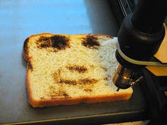
Adding to my collection of website stories about people's great DIY printers - here is a link to one prints images on toast.

In addition to their sublimely ridiculous toast printer, the Evil Mad Scientist Laboratory website also has a posting about a sugar printer which they built for about $500 which prints 3D objects. The printer's creators were inspired by a show of Rachel Whiteread at the Tate Modern - and enormous installation of white cast boxes, which resemble sugar cubes. The Tate's website has a great video of the installation being created in time lapse video. Whiteread has often come up in curatorial discussions at Philagrafika as an artist who works with multiples and works from a variety of matrices, for example her watertower project.

Here is the toast being printed:

Friday, January 18, 2008

Cardboard Carpets


One of my favorite materials to screenprint on is cardboard. (As part of an installation at the ICA last year, Space 1026 printed over 3,000 shingles of recycled cardboard!) So, I was immediately drawn to this design idea of printing cardboard with designs to create cardboard carpets by Wendy Plomp on the Free People blog today. An entirely new idea for urban installations - creating beautiful patterns, laying them out in the street and creating your own living room outside!

And, when you are finished laying out your carpet you could furnish your outdoor street installation with cardboard furniture by Cardboard Robot.

Here are some more links to blogs about the cardboard carpets

Wendy Plomp design site and another blog with article after seeing her in Domus magazine
http://www.wnd.nu/works/show/64/message-in-a-box.html

http://bloesem.blogs.com/bloesem/2008/01/message-in-a-bo.html

Monday, January 07, 2008

A Small Call for Entry


Small print shows happen all over the world - part of the nature of print, but I just came across an interesting call for entries for a print show at possibly the smallest gallery I've ever heard of.

As part of the 2008 Southern Graphics Council Conference at Virginia Commonwealth University the Locker 50B is seeking print entries. In March Locker 50B celebrates it's sixth year with "Inkling", a print exhibition, will be installed for that month in conjunction with the Southern Graphics Conference. Please note, no entries can be more than 4" in diameter.

Locker 50B homepage

Article in the Washington Post

Call for Entry


Southern Graphics Council Conference

By the way, Peter Nesbitt and Shelly Bancroft from Art on Paper will be the conference keynote speakers. The conference runs March 26-29, 2008 in Richmond, Virginia.

Friday, January 04, 2008

Reproduction Controversy in the News

Two exhibitions are sparking controversy and raising questions about the power of the print about Jacob Lawrence and his seminal work, The Migration of the Negro which completed in the 1940s. Triple Candie and the Whitney both have exhibitions up - the Triple Candie show is raising controversy in that they are showing the entire series as reproductions while the Whitney is showing only 17 of the 60 images. Lawrence conceived of the series as one work. The debate is interesting in that the reproductions shown in their entirety are more powerful than the singular images removed from their original context. Somehow, the ghost of Walter Benjamin's aura argument continues to circle.

Related Links
Triple Candie exhibition:
Undoing the Ongoing Bastardization of the Migration of the Negro by Jacob Lawrence

"Visions of a People in Motion" by Holland Cotter, New York Times, December 28, 2007

Whitney Museum exhibition

And The Trains Kept Coming Jacob Lawrence's The Migration Series on Tour funded by NEA

Jacob Lawrence at the Phillips Collection in DC

other blogs on exhibition
greg.org

Thursday, January 03, 2008

Printed Image in the West, an Online History

I came across a lovely resource this morning in my search for material relating to the teaching of the history of Graphic Arts. For a little background, I am particularly interested in the lack of this curriculum in the US - and realize that I was lucky at the University of New Mexico to have taken O.J. Rothrock's, History of Graphic Art. I am collecting syllabi from classes that I do find, and if you come across any - please send them to me at cperkins@philagrafika.org

The Printed Image in the West: History and Techniques

put together by Wendy Thompson from the Metropolitan Museum of Art's
Department of Drawings and Prints, includes wonderful illustrations and has information on woodcut, engraving, etching, drypoint, mezzotint, aquatint and lithography.


Two Views of the Head, 1746; Jacques-Fabien Gautier-Dagoty (French, 1716–1785) Plate 4 of Myologie complète en coleur et grandeur naturelle; Multiple-plate color mezzotint; Plate: 16 3/8 x 12 3/4 in. (41.6 x 32.4 cm)

Saturday, December 29, 2007

Print-Bot


Yes, here it is, the best DIY hack/mashup i've seen this morning. The iRobot mashed up with a dot matrix printer. This little thing is no master printer and the images are very rudimentary...but think of the possibilities! This one is printing with talcum powder on a carpet.


From the instructables website located at www.instructables.com


Thursday, December 27, 2007

Carvin' Block

Visit ArtintheAge.com for more info


Space 1026 member, Bill McRight is a hardworking printmaker - he's at it daily, I like to think of him as part of the blue collar artists, whose practice means constantly working without pretension--just because he can. His fellow studio mate Ben Woodward, filmed him carving a block in their studio over the course of a day and posted it on the Art in the Age website. I like his unique carving style - he lays out a patch of black and slowly builds up freeform patterns to create his fantastic lurking creatures, criminals on the lam or whatever.

Sunday, December 23, 2007

Shades of Forgiveness in Multiple


THE THING is a quarterly editioned object offered by two editors, Jonn Herschend and Will Rogan. Each year, four artists, writers, musicians or filmmakers are invited by the editors to create an everyday object that somehow incorporates text.

The first edition was created by Film maker and writer, Miranda July who created a silkscreened window shade with the text: "If this shade is down I'm begging your forgiveness on bended knee with tears streaming down my face."

An object such as this could easily be trite, but the theatricality of the language plays off the whimsy of the action of pulling the shade, with a balance of humour that I find intriguing. Or perhaps it is the irony of the bathroom setting?

See more about this editioned multiples at www.thethingquarterly.com.

I've recently been thinking about how artists other than visual artists might approach printmaking - and this is a great example of a project that expands out the medium of print.

I'm looking forward to seeing more by this group.

Caitlin

Wednesday, December 19, 2007

The Senate has a graphic art collection, who knew?

Shown here is a very large (for a mezzotint) - over 26 by 36 inches!

United States Senate Chamber by Thomas Doney, 1847

Senate Graphic Art Collection