Saturday, March 17, 2018

The Graphic Unconscious Exhibition Catalogue


The Graphic Unconscious Exhibition Catalogue is now available here: PGKA GU


The Graphic Unconscious Catalogue is a reference for the expanded field of printmaking featuring work by forty artists and collectives, working in a variety of media from traditional print to multi-disciplinary practices that were featured in the exhibition of the Philagrafika 2010 festival— Philadelphia’s international festival celebrating print in contemporary art that was held from January 29 through April 11, 2010. 

Essays by: José Roca, Sheryl Conkleton, Shelley Langdale, John Caperton, Lorie Mertes, Julien Robson, Caitlin Perkins and Luis Camnitzer with Photography by Greenhouse Media, Rebecca Mott and the artists.

Featured Artists:

Lisa Anne Auerbach, Eric Avery, Christiane Baumgartner, Erick Beltrán, Bitterkomix, Mark Bradford, Cannonball Press, Enrique Chagoya, Sue Coe, Julius Deutschbauer, Dexter Sinister, Dispatch, Drive By Press, Eloísa Cartonera, Art Hazelwood, Pablo Helguera, Orit Hofshi, Thomas Kilpper, Gunilla Klingberg, Virgil Marti, Paul Morrison, Óscar Muñoz, Pepón Osorio, Carl Pope, Qui Zhijie, Duke Riley, Betsabeé Romero, Francesc Ruiz, Jenny Schmid, Self Help Graphics & Art, Regina Silveira, Kiki Smith, Space 1026, Superflex, Swoon, Tabaimo, Temporary Services, Barthélémy Toguo, Tromarama, and YOUNG-HAE CHANG HEAVY INDUSTRIES.

* link to buy the catalog has been fixed

Sunday, February 17, 2013

Greetings from Iceland

Serena Perrone finds a perfect ice triangle during a day trip to Jokulsarlon. 


Please follow the Due North blog for updates on the artists, itinerary, and our adventures. 

Cindi Ettinger discusses Philagrafika at Islensk Grafik. Cindi's presentation was followed by artist talks by participating Due North artists. 

North-themed work in progress by Kristinn Hrafnsson during a studio visit. 

L to R : Islensk Grafik director Soffía Sæmundsdóttir, Cindi Ettinger, Serena Perrone, Marianne Bernstein, Kelsey Halliday Johnson, Katie Baldwin, and Shawn Bitters. 

Sunday, February 03, 2013

Introducing: Philagrafika Projects

[Photograph of the Northern Lights by David Kessler as he landed yesterday in Northern Iceland.]

Philagrafika Projects invites independent curators to undertake international projects that further contemporary print-based art. With a global approach and a local focus, these projects heighten Philadelphia's role as an artistic hub for cutting edge print practices. Philagrafika is pleased to announce its first project, Due North, an international collaboration envisioned by artist and curator Marianne Bernstein.

In January 2014, the Icebox Space in Philadelphia will be transformed into a winterscape featuring video and prints created by select artists from Philadelphia, PA and Reykjavik. Work will be made in 2013 through a series of group expeditions and residencies in Iceland. We are excited to announce that the first artists have landed in Northern Iceland and another group will be joining them on February 14th.

The participating artists are: Katie Baldwin, Marianne Bernstein, Shawn Bitters, Marianne Dages, Cindi Ettinger, Katya Gorker, John Heron, Kelsey Halliday Johnson, David Kessler, and Serena Perrone. The Icelandic printmakers will be announced shortly. Over the next few weeks, traveling artists will meet with Nordic artists and cultural leaders in Reykjavik, then travel to northern Iceland to experience the extreme landscape and conditions at the heart of this project's mission.

Please follow our adventures on the Due North blog as this project unfolds in the coming weeks.  http://duenorth2014.tumblr.com

Philagrafika
Advancing Philadelphia as an international center for contemporary printmaking

Sunday, November 25, 2012

Interview: Alex Lukas


With a wide range of artistic influences, Alex Lukas creates highly detailed drawings, subtly rendered prints, and complex 'zines. Moving between mono- or duo-tone and lush color, his work challenges the perception of the urban environment as a place of inevitable destruction. Though his landscapes can seem eerily foreboding and forsaken, the artist eschews the term "post- apocalyptic" for his work, preferring to leave the meaning behind his works open to viewer interpretation in a variety of ways. Lukas is a Philadelphia resident and member of Philadelphia-based collective Space 1026. His imprint, Cantab Publishing, has released over 35 small books and 'zines since 2001.

Recently Dan Haddigan talked with Alex about his ideas, his use of printmaking in contemporary work, and why superheroes don't seem to show up when you expect them to.

Dan Haddigan:  You have a very interesting and diverse body of work, incorporating a number of different techniques. Since this is the Philagrafika blog, I think the best way to start the conversation is for you to speak a little bit on your printmaking practice. I recall reading in an interview that you use a special silkscreen technique on your flooded-city pieces - the rendering of the water is all done by hand, and then silkscreened, correct? Do you ever re-use the same textures from one piece to the next? Can you discuss your feelings on the use of silkscreen techniques as a tool to produce a single image rather than a printed edition? What is your attitude, and your thoughts on printmaking in general, and printmaking as a tool to create certain effects?

Alex Lukas:  I try to use printmaking techniques where it is appropriate. I don't really consider myself a capital-P "Printmaker." I'll always consider myself a 'zine maker, since for a long time that was really my primary focus. When creating 'zines, I try to consider technique, form and the idea of editioning these printed objects-in-multiple.

That said, I have never taken a screen-printing class - so all of my knowledge came from observation, helpful peers and figuring it out myself. 


When I first started incorporating screen printing into my one-off drawings, the technique was heavily influenced by a lot of the posters and 'zines I had seen being produced in Providence, Rhode Island, where I went to college. Other than going to a few parties, I was never even tangentially involved in any of that Fort Thunder stuff, but I was really, really excited by the process of it - the use of transparent ink overlays especially. It is such a smart and economical way to produce color with just a few screens. When I realized I wanted to use this effect in my drawings, I couldn't figure out any other way than screen printing.

And, to me, that is still the key: using printmaking techniques for effects that I couldn't otherwise achieve. The screen-printed book pages that you are asking about usually involve a split-palette pull through an open screen - an opaque ink fading into a transparent over a partially masked-out cityscape. For many of my other drawings, I'll screen-print advertisements or murals - objects in the composition that I want present as distinct from my drawing. The water patterns I re-use many times, they are printed from photographs I find or take myself. The reflections of the buildings are painted into each work.


DH:  You've touched on what I think is one of the most exciting things happening within printmaking today. I think that the discipline is currently in the midst of an evolution, moving from something very structured and academic to a medium that’s more about experimentation and combining other media. Where in the past it’s been a tool to unleash multiples upon the world, now more and more artists are using print techniques in a much more fluid way. The fact that you regularly employ silkscreen techniques despite the fact that you've never taken a screen-printing class shows that you belong in sort of a "new school" of artists who learned the techniques second-hand and adapted them to your circumstances. (That’s not to say that printmakers haven't been experimental before, but now it seems extremely prevalent, more like the rule and less the exception.) You don’t have the onus of "the right way" floating above your head while you work, and I think it can be difficult for classically trained printmakers to steer away from that mindset. It really opens the door to a wealth of possibilities.

AL:  I agree - but I think this cross-disciplinary practice is really just the way people make artworks today in general, not just as it relates to printmaking. I like the idea of de-stigmatizing printmaking from a craft to just another tool like video or sculpture or performance. I think the idea of printmaking as a tool for craft and not simply another method of making work is outdated, but not everyone has come around yet. And, just for the record, I have taken some printmaking classes, just never a screen-printing class. I took a continuing-ed etching class and a letterpress class, and I'm very interested in those techniques, but screen-printing has always been the most attractive and appropriate method for my work.


DH:  In addition to the silkscreen drawings, you also do editioned prints, as well as run a 'zine publishing imprint. How do these works compare to your other work? Is it any more or less enjoyable than your mixed-media pieces or drawings? How important is it to your artistic process? Does the fact that you publish 'zines inform any other part of your work? Is there any connection between publishing others' work and appropriating published works (book pages) for your pieces?

AL:  I'm not sure I can quantify one as more or less enjoyable. All of it obviously comes from me - but I do consider them distinct bodies of work stemming from similar influences and interests. I used to get the comment a lot that I should add superheroes to my drawings - Superman flying through or something - but that doesn't really make sense to me. I get why the suggestion would be made, but it doesn't correlate with the reason I make those works. 


The drawings I make are intended (and this is a drastically oversimplified summation) as quiet reflections on violence and rebirth. The 'zines are generally collections of photographs, interviews or focused on the history of some obscure place. The superhero prints are nerdy one-liners. All of these things are interesting to me, feel important to make, and come from a similar place and set of experiences, but they have different goals, so I try not to cram all of these intentions into one body of work.

Like I discussed before, there is a lot of technical overlap and influence as well. I'm not sure if there is a correlation between publishing and appropriating, other than the natural impulse to collect printed stuff - books, 'zines, posters - it all accumulates together. I really like printed material.


DH:  Just because you have a lot to say doesn't mean you need to say it all at once. Good artists know how to edit themselves. It's important for artists to have ideas outside of their main body of work that occupy some mental real estate. I find that I have my best ideas when I'm focused on something else. It's interesting to me the way that two separate entities can overlap subconsciously. The fact that your superheroes are existentially walled off from the disasters they can help alleviate or prevent makes both bodies of work all the more interesting.

AL:  Yes, I think the delineation of the work is good, but it has also sometimes been a hindrance. It has gotten easier recently, but for a while, when an opportunity would come up for a show or an illustration project, I would need to ask very specifically what work of mine the person expected.

Very recently I've begun to try to break down some of the walls I've built up for compartmentalizing my own work. I'm increasingly interested in trying to incorporate some of the photography I do into the work I exhibit. I mean, it has always been integral for research and reference, but I've started to show some new drawings alongside diazotypes (blueprints) or unique photocopies that come directly from my reference photography. I'm really excited about the direction these pieces are going.


DH:  I saw a recent group show you were in at Extra Extra Gallery in Philadelphia, which I believe was their last show, appropriately enough. You had an installation set up, including a large white skeletal structure for displaying your framed pieces, flanked by potted plants and fluorescent lights. What spurred your work toward a more installation-based approach, and is this a direction you will continue with in the future? How do the structure and the plants push the work further, in your opinion?

AL:  I was really excited with the installation at Extra Extra. For a year and a half I have been working on a 'zine series titled OF NOTE. Each issue is one or two 11" x 17" photocopied pages folded into quarters and dedicated to photographs I've taken and collected together under a simple thematic umbrella: vans in the snow, a graffitied plant, hand-painted couches and so on. Issue #12 was just released. Sometimes it is a set of photographs taken in a few minutes, sometimes it takes a year to compile. Issue #7 was dedicated to fluorescent lights and the spaces they occupy - loading docks, vacant storefronts - generally commercial spaces. My favorites from this collection were fluorescent lights left on inside of vacant storefronts. As I've been hinting at ideas of commerce in my work for a while now, I decided to try incorporating this type of lighting into my installation at Extra Extra. The structure itself is a pretty direct extension of structures I've been building to hold my large drawings for a while, so it seemed appropriate.
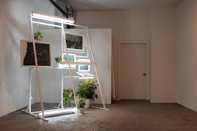


DH:  For all of its blank, dull evenness, fluorescent lighting can be very expressive. To use it as a sculpture or installation medium and to use it to light artwork is to make a very distinct decision about presentation, especially in the capacity you speak of. It's a very convenient and clever way to make that connection to commercialism without being too overt (the same goes for the billboard-inspired structures). In my opinion, when used to light artwork, fluorescent lighting has a way of making it look sort of ghastly, as opposed to the enhancing qualities of halogen lighting.

AL:  Fluorescent lighting has been a pretty well-trod path in contemporary art. Simon Boudvin's Concave series is one of my favorites. Robert Irwin. Dan Flavin, obviously. 
I'm not sure I agree with your characterization of fluorescent lights as making artworks look ghastly, though. I think a lot of galleries that I'm really excited about have exclusively fluorescent lights, but I take your point that it is a different way to view work. 

That line between the familiar and unfamiliar, between ease and disease, is really important to me. I'm really interested in pursuing that more through the structures and lights that hint at commerce but re-contextualize it. That is a similar impulse, in my mind, to depicting these scenes of destruction in a fashion that references the idealized depiction of our country in 19th-century American landscape painting.


DH:  Your subject matter is obviously pretty dark. However, the scenes you depict always have a certain light to them. Your color palette is generally neutral, the weather is often overcast, but it's not night time. Although humans are not depicted, there are still traces of life. The word apocalypse is thrown around pretty liberally, although not many people are familiar with the original meaning of the word - it relates to the permanent triumph of the forces of good over the forces of evil, the revelation of truth, the "lifting of the veil." Is this something that you think about when you approach your work conceptually? How much of this is a conscious decision in your work? Why do you choose to focus on this type of subject matter?

AL:  I like that - "lifting the veil." That is much more interesting and appropriate than the term "post-apocalyptic," which people often use in relation to my work. I get it: it is the most accessible descriptor for what I draw, but I think that focus is wrong for what I make. And I think in articulating why I dislike that term, I am able to describe my intentions better. These drawings are non-narratives - they are not meant to tell a particular story nor have a sense of a specific moment. So much of the fascination with end-time "post-apocalyptic" imagery gets burdened by particular descriptions of "what happened" - which often devolves into vampires and zombies or cautionary tales about global warming or nuclear proliferation. Some of those fears are more valid than others, but either way, I'm not trying to be a didactic picture-maker. I'm trying to take the specificity out of the image and focus instead on these contradictory feelings of anxiety and peace; hints of violence surrounded by rebirth through these placeless landscapes. These themes and contradictions are much more interesting to me.


The book pages are obviously not "place-less;" they all depict American cities, but by using older imagery I'm able to engage with ideas of false histories. The source of these book pages are usually coffee-table books from the 70s or 80s, so they generally depict skylines that are different from how they appear today. Sometimes buildings depicted have been demolished, sometimes I'll cover up other structures, sometimes the names of defunct companies still adorn facades. All of this is really, really interesting to me and takes away from the simple notion that this is a "warning of one possible future if we don't 'shape up'."
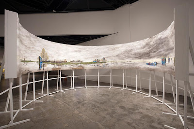


DH:  It's human nature to analyze an image and relate it to the present - we look at something and decide if it's now, the future or history, and then the next logical step is to construct a back-story for what we see. I think you do a great job of reducing specificity, but the instinct to contextualize will always be there. With your work, you seem to have a specific goal in mind. Do you think it detracts from the work if it operates on a narrative level? Are you troubled when people mistake your work as a warning message? You mentioned that using older images is a way to create disassociation; are there any other specific steps you take to achieve this? 

I'm very interested in the conceptual thinking and the depth of intellect in your work. Have you, or would you ever, consider doing any sort of written companion to your work?

AL:  I'm not sure about a written companion to the work. I feel much more comfortable dealing with these issues visually than through writing. I think it's just easier and more fun for me. 

I understand that the work will operate on a narrative level; it is a landscape painting, after all. I just ask the viewer to provide that narrative for themselves, starting with a set of cues I give, and then I hope the more they look at the work, the more they will question the narrative they initially had. 

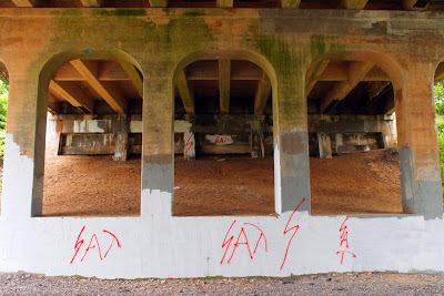
I'm always excited to find spray-painted graffiti written by high-school kids under bridges and on rocks. I love that method of communication because it is so hyper-specific ("Steve was here"), in that it lets you know exactly what happened ("Steve was here"), but at the same time, it is totally vague (Steve who? When was Steve here? Who was Steve with? Why did Steve decide to commemorate his arrival at this spot? Where did Steve go from here?). The more you think about it, the less specific it gets. I think that process is a good parallel for what I try to do with my drawings. 


Alex Lukas was born in Boston, Massachusetts in 1981 and raised in nearby Cambridge. He creates both highly detailed drawings and intricate Xeroxed 'zines. Lukas's imprint, Cantab Publishing, has released over 35 small books and 'zines since its inception in 2001. His drawings have been exhibited in New York, Boston, Philadelphia, Los Angeles, San Francisco, London, Stockholm and Copenhagen as well as in the pages of Swindle Quarterly, Proximity Magazine, the San Francisco Chronicle, the Village Voice, Philadelphia Weekly, Dwell magazine, Juxtapoz and the New York Times Book Review. Lukas is a graduate of the Rhode Island School of Design and now lives in Philadelphia, PA.

Alex's most recent projects include VIID and Underneath Providence. Click on the links to discover more of Alex's work. 

Click here to see behind-the-scenes images of Alex and Amanda D'Amico creating the 2011 Philagrafika Invitational Portfolio Print.

Dan Haddigan is a Philadelphia-based artist, writer and co-founder of Dirt is Dirt, a curated, submission-based, online art magazine. Discover more about Dan's work by visiting danhaddigan.com

Thursday, November 01, 2012

2012 IPR


Wednesday, May 30, 2012

Due North


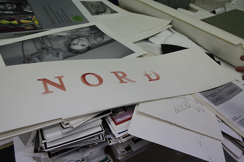
Local artist Marianne Dages (huldrapress.com) created these limited edition letter press cards and a beautiful poster for Marianne Bernstein's upcoming project Due North. Dages' printed works are a prelude to imagining "the north". An international artist residency will take place in Iceland culminating with an installation inside the Icebox Space at Crane Arts in 2014.

The imagery for the cards were made using only wood and metal type and ornaments found around the shop. Little pieces of punctuation, flourishes, and lines. The colors I chose were inspired by how I imagine the Icelandic landscape, a place I've never actually been to but am inspired by. The delicate green and deep scarlet are British Soldier lichen. The gray blue, the winter sky and ice. And the brown, the brown of hard soil and bare twigs.The words are a mix of Icelandic and English words, names from Norse mythology, words describing magic, and the elements of the island. -Marianne Dages

Special thanks to Common Press for lending their space and type for this project. 


Please stay tuned to the Philagrafika blog for more updates on Due North.

Saturday, May 26, 2012


Indeed the passing of many a great things is often exaggerated or simply false in these times of attention getting headlines...


Following up on the highly successful Doing Time / Depth of Surface residency and exhibition at Moore College of Art and Design, Philagrafika has mounted a rare public exhibition of a selection of its Invitational Portfolio Prints at Studio Christensen in Rittenhouse Square. (ultra-hip I believe is how the Art Blog referred to the space) The show features the 2011 Invitational Portfolio along with a selection of prints from past Portfolios, including works by Judith Shaechter, Isaac Lin, Stuart Netsky, and too many others to list here. Also included are two of the Signature Series prints created specifically for Philagrafika 2010; Eric Avery's Paradise Lost  and Regina Silviera's Pendent


In conjuction with the exhibition, Philagrafika is expanding on Working States, the online publication series started by José Roca and Caitlin Perkins, to include the first in a series of occasional Artists and Curatorial talks focusing on new projects that further the understanding of the influences of printmaking on contemporary art practices. On May 31, Philagrafika Portfolio Print artists Nami Yamamoto and Master Printer and RISD Assistant Professor Mary Anne Friel will discuss their recent collaboration Natural Discoursean exhibition co-curated by Mary Anne Friel and Shirley Watts opening at the University of California Berkeley's Botanical Gardens in June 2012. Space is still available for this talk so if you are in Philadelphia stop by, there are many great things to see and hear. Details here.


Thursday, January 26, 2012

Gomez and Gonzalez Install Doing Time/Depth of Surface


Our latest exhibition, Doing Time/Depth of Surface, is being installed this week by visiting Spanish artists Patricia Gómez & María Jesús González with a team of preparators from Moore College of Art & Design.  It's been busy in the Goldie Paley Gallery all week as we prepare for the January 27th opening reception at 5:30pm! We invite all of you to view the installation process live via Livestream! The opening reception as well as many other public programs will be broadcast through that link. The stream can also be accessed from the Philagrafika website.


Above is a gallery view of the prints before they were unrolled! Below is an image of one of the prints being fully extended by the artists outside of Holmesburg Prison during their artist residency in the fall of 2011.


Monday, November 14, 2011

Philagrafika Project inspired CD release

Neil Leonard performing
at the Paul Robeson House
for Philagrafika, 2007
In 2007 Philagrafika commissioned jazz musician Neil Leonard to compose music to accompany Maria Magadelena Campos Pons' art installation Corner/Opera. Rethinking a Site. This installation of wallpaper, textiles and sound was created to celebrate the first phase of restoration of the Paul Robeson House--the house where he spent much of the last ten years of his life in West Philadelphia. The installation was part of the Re:Print  Re:Present  Re:View exhibition that Philagrafika produced as lead up to Philagrafika 2010: The Graphic Unconscious.
Below is a link to listen to recording of the live performance of 4951Walnut Street in Paul Robeson's house at 4951 Walnut Street in Philadelphia. This live performance included Neil Leonard - woodwinds; Tom Lawton - piano (Dave Douglas, Don Byron); Lee Smith - bass (Mongo Santamaria, Cedar Walton, Roberta Flack); and Craig McIver - drums (Max Roach M-Boom, Odean Pope).
http://neilleonard.com/audio/4951WalnutStreetLive.mp3


The CD of works, including the work Neil Leonard composed for the Philagrafika installation, is now out on CD. He will premiere the works at the Philadelphia Museum of Art on November 18th at 5 pm. 


CD release performance:
November 18th, 2011 5:00 pm
The Philadelphia a Museum of Art
26th Street and Benjamin Franklin Parkway, Philadelphia, PA

For more information call (215) 763-8100
CD release information:
http://neilleonardevents.blogspot.com/2011/10/new-cd-marcels-window-available-on.html


Press release:
http://www.allaboutjazz.com/php/news.php?id=88506

And two articles from Cuban press just came out about the recordings this week:
http://www.prensa-latina.cu/index.php?option=com_content&task=view&id=449196&Itemid=1
http://www.elnuevoherald.com/2011/11/11/1063534/neil-leonard-asistira-a-festival.html


Monday, October 31, 2011

Prints Gone Wild

Printmaking is Art by Caitlin Emma Perkins
Photo of Non Grata performing at
Prints Gone Wild in St. Louis. Caitlin Perkins, 2008
Attention! Attention!
The ink-slinging, typesetting tricksters Mike Houston and Martin Mazorra of Cannonball Press, are pulling back the curtains on their sixth annual sideshow: Prints Gone Wild at Secret Project Robot in Brooklyn on Friday and Saturday.

This print-maker mayhem will unroll during Print Week when a ragtag mob of dirty printmakers descend on Brooklyn to peddle their affordable art. With prices better than a stick in the eye (everything is less than $50) you are guaranteed to find prints more healing than snake oil for your visual pleasure. Head out to Brooklyn to pick up a juicy print bursting with fresh ink and catch some live music and sip on beer.

Now, I may just be a sideshow shill, but I can attest to the value of the prints these artists are peddling, I treasure each one I’ve scored at past Prints Gone Wildthey cured my walls of beigedom with their shock of black and white graphics.

6th Annual Prints Gone Wild
Friday, November 4th 6 pm to 12 am and Saturday, November 5th from 12 to 6 pm
Location: Secret Project Robot
389 Melrose St. in Brooklyn (between Flushing and Knickerbocker Aves in Bushwisk--just a few short blocks from the Morgan Ave L stop)

Philagrafika and Cannonball Press will also be at the E/AB fair in Chelsea during Print Week, and for more information on that: http://www.philagrafika.org/portfolio-release.html

Friday, June 24, 2011

Spanish Artists Doing Time at Holmesburg Prison


Dear friends:

Philagrafika is embarking in a new project, working towards the next incarnation of the festival tentatively scheduled for 2014. The project is titled Doing Time, and consists of a site-specific work of Spanish artists Patricia Gómez and María Jesús González that will come out of a six-week residency in Philadelphia. The results will be shown at Moore College of Art & Design, our longtime partner.


Patricia and María Jesús, who live in Valencia, Spain, have taken a technique called strappo, commonly used by restorers to salvage murals from walls that are deteriorating or from buildings that are to be demolished, and applied it towards artistic goals. Strappo is a complex process, but it could be described as adhering a thin fabric on the surface of a wall with water-soluble glue, waiting for it to dry, and then peeling off the fabric, which takes with it the outer surface of the wall in question (and whatever images are on it). Once on the fabric, the paint can be seen right-side up because of the transparency of the type of voile used, or from behind if attached to an opaque fabric. If needed, the paint can be attached again to another wall or canvas with glue that does not dissolve in water, and then the original fabric can be moistened, peeled away, and the glue dissolved until the painting is visible again.


The artists, who studied printmaking in the context of a conservation school in Italy, consider their work a monoprint, which it technically is, because the matrix (in this case the wall) is transferring its ink (the paint) onto a surface (the voile), and it produces a single copy. They came upon this technique when priming a canvas that they had to staple to the studio wall because they did not have a stretcher. When the primer dried and they wanted to transfer the canvas to another space, they discovered that the back had taken with it the surface of the wall, and they thought that the colored shape of the decaying wall was a beautiful image in its own right.


Soon after, they decided to try the technique in more complex projects. Learning that the El Cabañal neighborhood in Valencia was slated for demolition, they brought bolts of fabric and painstakingly took the imprints of twelve of the beautiful Modernist houses shortly before they were destroyed. The resulting print, a roll 340 m long by 2 m high (about 1116 by 7 feet!), is at the same time a print and an archive, the sole remainder of the houses that disappeared, merging space and time in a potent image that encompasses memory, history and place.


Homes in the El Cabañal neighborhood in Valencia


The possibilities of the technique as a tool for capturing time became apparent then, as the walls in architecture contain not only a defined space but bear the evidence of the passing of time in the form of marks, layers of paint and patina. We all know that when a house is "lived in" means that it has that unequivocal ambience of warmth that new or renovated spaces don't, and there is truth to the common adage "If walls could talk" in the sense of being the silent witnesses of what happens over time, which is physically and metaphorically imprinted in them. Patricia and Maria Jesús sought to capture this time imbued in interior architecture, and chose as an example one of the places where the passing of time is more palpable: the walls of a prison.


Strappo print from the Cárcel Modelo in Valencia


The Cárcel Modelo (Model prison) in Valencia had been abandoned for 15 years when the artists decided to do their intervention. The space had the kind of decay which befalls abandoned structures that nonetheless have a sturdy construction -not structural, but superficial, product of being left alone to gather dust. Gómez and González peeled away the entire walls of several of the cells, and showed the results on the central space of the prison, unfolding, as it were, the space and in so doing confronting the viewer with the actual size of the space where a human being spend years, decades at a time in solitary confinement.


Moss covered prison cell, Holmesburg Prison, Northeast Philadelphia


Holmesburg prison, in Northeast Philadelphia, opened in 1896 and functioned for just a little more than a century. Built according to radial configuration inspired on Bentham's principle of the Panopticum (where a central eye would be able to control everything around it), it has a central control tower from which depart long corridors lined with cells on both sides. The cells themselves are narrow and tall, and have skylights that let light and ventilation in. Unfortunately, being on the ground, these cells are very humid, and on the course of the fifteen years since the prison was decommissioned, the paint on the walls and even the plaster on some of them have peeled off or fallen down.


In 2000 photographer Thomas Roma produced a beautiful book, In Prison Air, which documented the derelict state of the prison (it is startling to see how the walls and markings he documented have since degraded further, some to the point of no recognition). Holmesburg has also been the location for at least three movies, Up Close & Personal (1996), Animal Factory (2000), and Law-Abiding Citizen (2009).


Prison cell, Holmesburg Prison, Northeast Philadelphia


Gomez and González' project involves salvaging the outer surfaces of some of the cells at Holmesburg. They are also looking at interesting grafitti and other types of markings on the walls. As is customary in their practice, they will let the encounter with the site direct the path their project will take. Philagrafika will be reporting on the advancement of their project through this blog. Stay tuned!


José Roca, curator, Doing Time

Thursday, May 26, 2011

Slow like Molasses

A sticky warm spring night at Space 1026 and the bell rang-announcing a slow moving group of sweet printmakers crawling up the gallery stairs. They had descended upon the streets of Philadelphia to promote their print show Melaza (or molasses) opening this week at James Oliver Gallery.

USA LA MELAZA 2 is the the second installment of a international print making collaboration by the five artists including Grimaldi “Barbarian” Baez, Omar “Pickle Fingers” Velazquez, Kyle “Canned-Tux” Nilan, Patrick “Print Wraith”Casey, Eli “The Word” Epstein.

They gave me a beautiful show poster (here's a pic) and told me to stop by the James Oliver Gallery on Friday. Its a popup show, and will only be up for 10 days so catch it while you can. The gallery is located at 723 Chestnut Street on the 4th floor. 

Wednesday, May 18, 2011

Enrique Chagoya's "The Head Ache" at The Met

The Headache: A Print After George Cruikshank, 2010. Enrique Chagoya

On May 12th, the New York Times published an article about an upcoming exhibition at the Metropolitan Museum of Art entitled, “Infinite Jest: Caricature and Satire from Leonardo to Levine,” which opens on September 13.1 Presenting a number of satirical works from the Met’s own collection of drawings and prints, the show will also include a print by Philagrafika 2010 artist Enrique Chagoya entitled, “The Headache: A Print After George Cruikshank” (2010).

Created as a part of Philagrafika 2010’s Out of Print program, “The Headache” emerged out of the Rosenbach Museum and Library’s Cruikshank collection, referring to a 19th-century print by Cruikshank entitled, “The Head Ache.” The print itself features President Barack Obama being
tormented at the hands of the small beasts representing the trials he inherited with his presidency, such as healthcare reform, the war in Iraq, and the recession.

To create the print, Chagoya married a number of modern and traditional print techniques in homage to Cruikshank’s original image. After separating the orginal print into its two parts: the etching itself and the hand-colored watercolor, Chagoya first printed the watercolor digitally, and then converted the second element onto a new etching plate in which he replaced the original figure’s face with that of President Obama. Chagoya then brought these two elements back together with the assistance of Cindi Ettinger of C. R. Ettinger Studio in Philadelphia through a chine collé process. For this multi-process print, Enrique also worked with Rick Decoyte at Silicon Gallery Fine Art Prints in Philadelphia as well as Don Farnsworth at Magnolia Editions in Oakland, Ca.

The Rosenbach unveiled the newly created print alongside Cruikshank’s original, along with a hand-coloring workshop
in which visitors were invited to color black and white versions of the print.


Enrique Chagoya and visitors during the public watercoloring event at The Rosenbach Museum and Library

For the workshop, Chagoya allowed visitors to “color in our own stories” making them collaborators in his joke with his participation in Philagrafika 2010’s Out of Print series, and his piece, “The Headache: A Print After George Cruikshank” is sure to make a great addition to the Met’s upcoming exhibition as well.2

To see more images and information about Enrique Chagoya's project for the Out of Print series, see his link here to our Philagrafika 2010 festival website: http://www.philagrafika2010.org/artist/enrique-chagoya

A more in-depth discussion of Chagoya’s involvement in Philagrafika 2010, and the entire Out of Print series are available in our recently released catalogue, Philagrafika 2010: The Graphic Unconscious. The print is also available for purchase as a part of Philagrafika 2010’s Signature Edition Series. For more information, please contact Rebecca Mott at rmott@philagrafika.org

____________________________________________________________

  1. For the full New York Times article: http://www.nytimes.com/2011/05/13/arts/design/infinite-jest-caricatures-at-met-and-art-at-high-line.html?_r=3&sq=enrique+chagoya&st=cse&adxnnl=1&scp=1&adxnnlx=1305288069-JfwcuSZKjXckmhNeHQ5Gow
  2. Perkins, Caitlin. Philagrafika 2010: The Graphic Unconscious, p. 97.