
Please see the posting about Megawords project in ArtForum.com (diary article by William Pym.)
Monday, September 11, 2006
Friday, September 08, 2006
 It all starts with the printed image.
Panelist and artist Zoe Strauss summed it up when she said that all the artists on the panel (ESPO, Tony Smirsky, Dan Murphy and Zoe herself) start with the printed image and move in different directions.
One manifestation shown here from the luminescent Megawords installation at the Powel House is a video projection of a spinning car wheel - creating an imprint on the dining room wall, playing off of the 18th century ornamentation and  portraiture. All images here are from the 2006 installation at the Powel House Museum.
Thursday, September 07, 2006

Walter Benjamin, in his 1936 seminal essay, The Work of Art in the Age of Mechanical Reproduction, identified the aura as that which withers in the age of mechanical reproduction; the aura is the uniqueness of an individual work of art. This idea of a withering aura has a new challenge posed during a Philagrafika panel discussion on September 6th, about Megawords Magazine.
The artists who create Megawords magazine, use the commercial process of offset lithography, to create an art object. Yet, in this digital age, somehow a mechanically printed magazine has become an object of nostalgia, with a very strong aura created through the imagery, content and means of distribution.
Megawords is also telling a story of place. Steve Powers, one of the panelists, identified this image from Megawords, of Herr's potato chip bags as being a powerful image and part of the story that the artists are telling about Philadelphia-showing their version of Philadelphia.
The men behind Megawords magazine have created an issue that will be used as part of an installation at the Powel House Museum in Philadelphia. The artists are using the commercial process of offset lithography to make a small run art object that they are incorporating into a more extensive installation in an 18th century house museum located within a contemporary urban environment.
When asked to respond to their process and product I'm inclined to focus on the issue of control. Tony and Dan work in a way that ostensibly allows them to have complete control over the production of Megawords: they argue against corporate sponsorship or including advertisements in the magazine because they don't want their choice of content to be influenced by a demanding funder; they talk about the do-it-yourself nature of their work. In an attempt to tie this to the larger issue at hand -- exploring the nature of the printed image -- I want to ask, what is it about the publication process that allows us to think of Tony and Dan as having full control when the physical production of the magazine happens at a press halfway across the country?
Tuesday, September 05, 2006
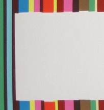

This is my most recent print - I thought I'd post my thinking that went into its creation. The image is made up of 12 colors in randomly sequenced vertical stripes, and there is a white horizontal rectangle of negative space cut out of the stripes towards the bottom of the image. (to the right is a detail) The white space is meant to juxtapose with the colorful visual noise of the stripes; its presence is defined by their absence.
The margins of these screenprinted lines would normally be relagated to the periphery of the print, but I realized that they are what fascinated me the most, and so I brought them into the middle of the image, defining the negative space of the white rectangle, the background as forground.
From afar the rectangle looks like a clean, perhaps even computer generated, shape. Yet as you approach the image, the imperfections of this shape become clear. The bars of color imperfectly align to create the illusion of the rectangle. This to me signifies the difference between a computer generated image or a massively reproduced offset poster, and the modestly reproduced hand-made screenprint: the mark of the producer, or we could say the press, remains as an integral visual element of the final print.
I think in general, edges are an important dimension of most prints. Whether it is the sunken edge of an etching or block print, or in this case the jagged, imperfect edges of screen printed bars, they help to signify the particular process of production responsible for each print. Thoughts?
Subscribe to:
Posts (Atom)

