With a wide range of artistic influences, Alex Lukas creates highly detailed drawings, subtly rendered prints, and complex 'zines. Moving between mono- or duo-tone and lush color, his work challenges the perception of the urban environment as a place of inevitable destruction. Though his landscapes can seem eerily foreboding and forsaken, the artist eschews the term "post- apocalyptic" for his work, preferring to leave the meaning behind his works open to viewer interpretation in a variety of ways. Lukas is a Philadelphia resident and member of Philadelphia-based collective Space 1026. His imprint, Cantab Publishing, has released over 35 small books and 'zines since 2001.
Recently Dan Haddigan talked with Alex about his ideas, his use of printmaking in contemporary work, and why superheroes don't seem to show up when you expect them to.
Dan Haddigan: You have a very interesting and diverse body of work, incorporating a number of different techniques. Since this is the Philagrafika blog, I think the best way to start the conversation is for you to speak a little bit on your printmaking practice. I recall reading in an interview that you use a special silkscreen technique on your flooded-city pieces - the rendering of the water is all done by hand, and then silkscreened, correct? Do you ever re-use the same textures from one piece to the next? Can you discuss your feelings on the use of silkscreen techniques as a tool to produce a single image rather than a printed edition? What is your attitude, and your thoughts on printmaking in general, and printmaking as a tool to create certain effects?
Alex Lukas: I try to use printmaking techniques where it is appropriate. I don't really consider myself a capital-P "Printmaker." I'll always consider myself a 'zine maker, since for a long time that was really my primary focus. When creating 'zines, I try to consider technique, form and the idea of editioning these printed objects-in-multiple.
That said, I have never taken a screen-printing class - so all of my knowledge came from observation, helpful peers and figuring it out myself.
When I first started incorporating screen printing into my one-off drawings, the technique was heavily influenced by a lot of the posters and 'zines I had seen being produced in Providence, Rhode Island, where I went to college. Other than going to a few parties, I was never even tangentially involved in any of that Fort Thunder stuff, but I was really, really excited by the process of it - the use of transparent ink overlays especially. It is such a smart and economical way to produce color with just a few screens. When I realized I wanted to use this effect in my drawings, I couldn't figure out any other way than screen printing.
And, to me, that is still the key: using printmaking techniques for effects that I couldn't otherwise achieve. The screen-printed book pages that you are asking about usually involve a split-palette pull through an open screen - an opaque ink fading into a transparent over a partially masked-out cityscape. For many of my other drawings, I'll screen-print advertisements or murals - objects in the composition that I want present as distinct from my drawing. The water patterns I re-use many times, they are printed from photographs I find or take myself. The reflections of the buildings are painted into each work.

DH: You've touched on what I think is one of the most exciting things happening within printmaking today. I think that the discipline is currently in the midst of an evolution, moving from something very structured and academic to a medium that’s more about experimentation and combining other media. Where in the past it’s been a tool to unleash multiples upon the world, now more and more artists are using print techniques in a much more fluid way. The fact that you regularly employ silkscreen techniques despite the fact that you've never taken a screen-printing class shows that you belong in sort of a "new school" of artists who learned the techniques second-hand and adapted them to your circumstances. (That’s not to say that printmakers haven't been experimental before, but now it seems extremely prevalent, more like the rule and less the exception.) You don’t have the onus of "the right way" floating above your head while you work, and I think it can be difficult for classically trained printmakers to steer away from that mindset. It really opens the door to a wealth of possibilities.
AL: I agree - but I think this cross-disciplinary practice is really just the way people make artworks today in general, not just as it relates to printmaking. I like the idea of de-stigmatizing printmaking from a craft to just another tool like video or sculpture or performance. I think the idea of printmaking as a tool for craft and not simply another method of making work is outdated, but not everyone has come around yet. And, just for the record, I have taken some printmaking classes, just never a screen-printing class. I took a continuing-ed etching class and a letterpress class, and I'm very interested in those techniques, but screen-printing has always been the most attractive and appropriate method for my work.

DH: In addition to the silkscreen drawings, you also do editioned prints, as well as run a 'zine publishing imprint. How do these works compare to your other work? Is it any more or less enjoyable than your mixed-media pieces or drawings? How important is it to your artistic process? Does the fact that you publish 'zines inform any other part of your work? Is there any connection between publishing others' work and appropriating published works (book pages) for your pieces?
AL: I'm not sure I can quantify one as more or less enjoyable. All of it obviously comes from me - but I do consider them distinct bodies of work stemming from similar influences and interests. I used to get the comment a lot that I should add superheroes to my drawings - Superman flying through or something - but that doesn't really make sense to me. I get why the suggestion would be made, but it doesn't correlate with the reason I make those works.
The drawings I make are intended (and this is a drastically oversimplified summation) as quiet reflections on violence and rebirth. The 'zines are generally collections of photographs, interviews or focused on the history of some obscure place. The superhero prints are nerdy one-liners. All of these things are interesting to me, feel important to make, and come from a similar place and set of experiences, but they have different goals, so I try not to cram all of these intentions into one body of work.
Like I discussed before, there is a lot of technical overlap and influence as well. I'm not sure if there is a correlation between publishing and appropriating, other than the natural impulse to collect printed stuff - books, 'zines, posters - it all accumulates together. I really like printed material.
DH: Just because you have a lot to say doesn't mean you need to say it all at once. Good artists know how to edit themselves. It's important for artists to have ideas outside of their main body of work that occupy some mental real estate. I find that I have my best ideas when I'm focused on something else. It's interesting to me the way that two separate entities can overlap subconsciously. The fact that your superheroes are existentially walled off from the disasters they can help alleviate or prevent makes both bodies of work all the more interesting.
AL: Yes, I think the delineation of the work is good, but it has also sometimes been a hindrance. It has gotten easier recently, but for a while, when an opportunity would come up for a show or an illustration project, I would need to ask very specifically what work of mine the person expected.
Very recently I've begun to try to break down some of the walls I've built up for compartmentalizing my own work. I'm increasingly interested in trying to incorporate some of the photography I do into the work I exhibit. I mean, it has always been integral for research and reference, but I've started to show some new drawings alongside diazotypes (blueprints) or unique photocopies that come directly from my reference photography. I'm really excited about the direction these pieces are going.
DH: I saw a recent group show you were in at Extra Extra Gallery in Philadelphia, which I believe was their last show, appropriately enough. You had an installation set up, including a large white skeletal structure for displaying your framed pieces, flanked by potted plants and fluorescent lights. What spurred your work toward a more installation-based approach, and is this a direction you will continue with in the future? How do the structure and the plants push the work further, in your opinion?
AL: I was really excited with the installation at Extra Extra. For a year and a half I have been working on a 'zine series titled OF NOTE. Each issue is one or two 11" x 17" photocopied pages folded into quarters and dedicated to photographs I've taken and collected together under a simple thematic umbrella: vans in the snow, a graffitied plant, hand-painted couches and so on. Issue #12 was just released. Sometimes it is a set of photographs taken in a few minutes, sometimes it takes a year to compile. Issue #7 was dedicated to fluorescent lights and the spaces they occupy - loading docks, vacant storefronts - generally commercial spaces. My favorites from this collection were fluorescent lights left on inside of vacant storefronts. As I've been hinting at ideas of commerce in my work for a while now, I decided to try incorporating this type of lighting into my installation at Extra Extra. The structure itself is a pretty direct extension of structures I've been building to hold my large drawings for a while, so it seemed appropriate.
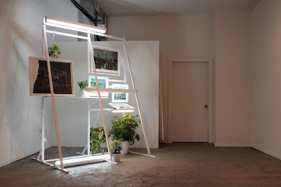
DH: For all of its blank, dull evenness, fluorescent lighting can be very expressive. To use it as a sculpture or installation medium and to use it to light artwork is to make a very distinct decision about presentation, especially in the capacity you speak of. It's a very convenient and clever way to make that connection to commercialism without being too overt (the same goes for the billboard-inspired structures). In my opinion, when used to light artwork, fluorescent lighting has a way of making it look sort of ghastly, as opposed to the enhancing qualities of halogen lighting.
AL: Fluorescent lighting has been a pretty well-trod path in contemporary art. Simon Boudvin's Concave series is one of my favorites. Robert Irwin. Dan Flavin, obviously.
I'm not sure I agree with your characterization of fluorescent lights as making artworks look ghastly, though. I think a lot of galleries that I'm really excited about have exclusively fluorescent lights, but I take your point that it is a different way to view work.
That line between the familiar and unfamiliar, between ease and disease, is really important to me. I'm really interested in pursuing that more through the structures and lights that hint at commerce but re-contextualize it. That is a similar impulse, in my mind, to depicting these scenes of destruction in a fashion that references the idealized depiction of our country in 19th-century American landscape painting.

DH: Your subject matter is obviously pretty dark. However, the scenes you depict always have a certain light to them. Your color palette is generally neutral, the weather is often overcast, but it's not night time. Although humans are not depicted, there are still traces of life. The word apocalypse is thrown around pretty liberally, although not many people are familiar with the original meaning of the word - it relates to the permanent triumph of the forces of good over the forces of evil, the revelation of truth, the "lifting of the veil." Is this something that you think about when you approach your work conceptually? How much of this is a conscious decision in your work? Why do you choose to focus on this type of subject matter?
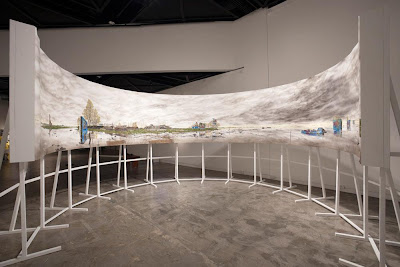
AL: I like that - "lifting the veil." That is much more interesting and appropriate than the term "post-apocalyptic," which people often use in relation to my work. I get it: it is the most accessible descriptor for what I draw, but I think that focus is wrong for what I make. And I think in articulating why I dislike that term, I am able to describe my intentions better. These drawings are non-narratives - they are not meant to tell a particular story nor have a sense of a specific moment. So much of the fascination with end-time "post-apocalyptic" imagery gets burdened by particular descriptions of "what happened" - which often devolves into vampires and zombies or cautionary tales about global warming or nuclear proliferation. Some of those fears are more valid than others, but either way, I'm not trying to be a didactic picture-maker. I'm trying to take the specificity out of the image and focus instead on these contradictory feelings of anxiety and peace; hints of violence surrounded by rebirth through these placeless landscapes. These themes and contradictions are much more interesting to me.

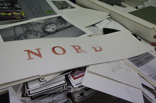
The book pages are obviously not "place-less;" they all depict American cities, but by using older imagery I'm able to engage with ideas of false histories. The source of these book pages are usually coffee-table books from the 70s or 80s, so they generally depict skylines that are different from how they appear today. Sometimes buildings depicted have been demolished, sometimes I'll cover up other structures, sometimes the names of defunct companies still adorn facades. All of this is really, really interesting to me and takes away from the simple notion that this is a "warning of one possible future if we don't 'shape up'."
DH: It's human nature to analyze an image and relate it to the present - we look at something and decide if it's now, the future or history, and then the next logical step is to construct a back-story for what we see. I think you do a great job of reducing specificity, but the instinct to contextualize will always be there. With your work, you seem to have a specific goal in mind. Do you think it detracts from the work if it operates on a narrative level? Are you troubled when people mistake your work as a warning message? You mentioned that using older images is a way to create disassociation; are there any other specific steps you take to achieve this?
I'm very interested in the conceptual thinking and the depth of intellect in your work. Have you, or would you ever, consider doing any sort of written companion to your work?
AL: I'm not sure about a written companion to the work. I feel much more comfortable dealing with these issues visually than through writing. I think it's just easier and more fun for me.
I understand that the work will operate on a narrative level; it is a landscape painting, after all. I just ask the viewer to provide that narrative for themselves, starting with a set of cues I give, and then I hope the more they look at the work, the more they will question the narrative they initially had.
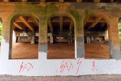
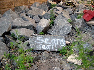
I'm always excited to find spray-painted graffiti written by high-school kids under bridges and on rocks. I love that method of communication because it is so hyper-specific ("Steve was here"), in that it lets you know exactly what happened ("Steve was here"), but at the same time, it is totally vague (Steve who? When was Steve here? Who was Steve with? Why did Steve decide to commemorate his arrival at this spot? Where did Steve go from here?). The more you think about it, the less specific it gets. I think that process is a good parallel for what I try to do with my drawings.
Alex Lukas was born in Boston, Massachusetts in 1981 and raised in nearby Cambridge. He creates both highly detailed drawings and intricate Xeroxed 'zines. Lukas's imprint, Cantab Publishing, has released over 35 small books and 'zines since its inception in 2001. His drawings have been exhibited in New York, Boston, Philadelphia, Los Angeles, San Francisco, London, Stockholm and Copenhagen as well as in the pages of Swindle Quarterly, Proximity Magazine, the San Francisco Chronicle, the Village Voice, Philadelphia Weekly, Dwell magazine, Juxtapoz and the New York Times Book Review. Lukas is a graduate of the Rhode Island School of Design and now lives in Philadelphia, PA.
Click here to see behind-the-scenes images of Alex and Amanda D'Amico creating the 2011 Philagrafika Invitational Portfolio Print.
Dan Haddigan is a Philadelphia-based artist, writer and co-founder of Dirt is Dirt, a curated, submission-based, online art magazine. Discover more about Dan's work by visiting danhaddigan.com.