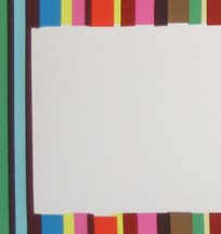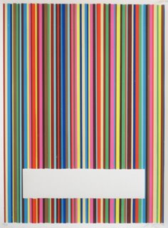

This is my most recent print - I thought I'd post my thinking that went into its creation. The image is made up of 12 colors in randomly sequenced vertical stripes, and there is a white horizontal rectangle of negative space cut out of the stripes towards the bottom of the image. (to the right is a detail) The white space is meant to juxtapose with the colorful visual noise of the stripes; its presence is defined by their absence.
The margins of these screenprinted lines would normally be relagated to the periphery of the print, but I realized that they are what fascinated me the most, and so I brought them into the middle of the image, defining the negative space of the white rectangle, the background as forground.
From afar the rectangle looks like a clean, perhaps even computer generated, shape. Yet as you approach the image, the imperfections of this shape become clear. The bars of color imperfectly align to create the illusion of the rectangle. This to me signifies the difference between a computer generated image or a massively reproduced offset poster, and the modestly reproduced hand-made screenprint: the mark of the producer, or we could say the press, remains as an integral visual element of the final print.
I think in general, edges are an important dimension of most prints. Whether it is the sunken edge of an etching or block print, or in this case the jagged, imperfect edges of screen printed bars, they help to signify the particular process of production responsible for each print. Thoughts?
Tuesday, September 05, 2006
Subscribe to:
Post Comments (Atom)


No comments:
Post a Comment